Showing posts with label watercolours. Show all posts

Monday, April 6, 2015

DLP Week 14: It's Water Under the Bridge...

This week's DLP challenge was to explore watercolours and the challenge quote was 'It's water under the bridge.' I decided to stay away from anything too literal but still wanted to keep to the theme of the challenge.  


As I do each week, I used washi tape and some collage components to create my calendar/journalling area. This way, even if I don't get to the art on the rest of the page right away, I can still record my daily entries at the end of each day.


I used additional washi tape to create a border around the remaining part of the page spread.
Searching the Internet, I found this wonderful butterfly that I was able to resize and print in a variety of sizes. I used Tombow markers and my waterbrush to colour them. I then layered the larger ones with a piece of old sheet music and a map page from an old atlas so that when I cut them out I'd have three layers.
 I had a lovely piece of tissue paper with script on it, so I stabilized it with some fusible interfacing, misted it with a spray bottle and then painted it with a variety of Winsor & Newton watercolour paints to create a beautiful, watery wash.


Once the background had dried, I took my layered butterflies and the background sheet over to the sewing machine-this is why I had to stabilize the tissue paper.
I machine stitched the butterflies to the background sheet by sewing over the body of the butterfly, leaving the wings free.

This was then glued into my journal, leaving the border to show around the edges of the 'water'.


I think this is a beautiful quote.

"Perhaps the butterfly is proof that you can go through a lot of darkness and yet become something beautiful."

To me it ties in to the idea of the past being water under the bridge...it doesn't have to undermine the beauty that we can still have within us.


Friday, June 6, 2014

Art Journal Calendar...

I'm continuing on with Joanne Sharpe's Draw Your Awesome Year online class. Although I'm behind in a lot of the lesson pages, my May calendar is filled in and June's spread is done. I'm doing my best to keep up with my daily entries...this picture was actually taken on Tuesday, so I'm up-to-date so far!

Wednesday, April 30, 2014

Beautiful Cursive...

I have long admired the beautiful cursive writing of Lori Vliegen and her lovely, simple style of art journalling.  Being left handed, I gave up cursive writing for a personalized 'cursive' printing back in junior high when we were required to use binders for our notes and the rings interfered with my ability to write.  For some reason, I guess I hold my hand differently to print so I developed a form of joined printing that allowed me to take notes more quickly while avoiding those silly rings.  However, in spite of the fact that I think my hand writing looks okay, I've always wanted to teach myself beautiful, fluid cursive writing.

I decided to take Lori's Letter Lab online class.  It was just the bit of missing info I needed to help me refine my writing.  I've been practising for a few minutes everyday and hopefully in time it will become faster and more my own.

Add all of that to the fact that the last few days I've been feeling unmotivated and somewhat stressed, and in comes this journal page, because...


Friday, March 1, 2013

Finger Painting and Some Inky Text


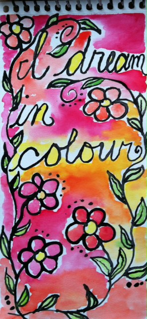
When I was first watching Joanne's lesson 18 video, I was laughing...yup Joanne, I was one of the ones you were threatening to send to the principal's office. LOL However, seeing as I seldom keep my fingers out of the paint when I do play with acrylics, I thought why not do lettering with my fingers.  And it was fun.  I like the thick rich texture I could achieve.

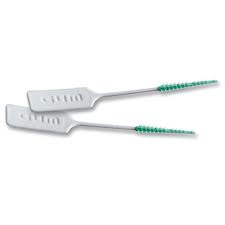
In another couple of lessons, we were exploring different mark making tools.  I used the little Gum dental soft picks as my 'pen' for the page on the left.  I just dipped it into the India ink as needed while I wrote.  It like the control I had with it so that I could write fairly easily while still getting a looser looking text that with a regular pen.

The page on the right was done using the dropper in the India ink bottle.  That was a bit harder to write with, but again it gives an interesting, loose text.

Judging by the watercolour background of the second page, I think I'm finally beginning to get a better feel for leaving some white space as I paint.  I'll need to keep working on that...

Sunday, February 10, 2013

I Really Need Some Discipline...


My plan for yesterday was to do some sewing.  I've got several art quilts in process that I really want to finish (honest!).

Enter Joanne Sharpe and her Letter Love 201 online class...  I know I can do these 'lessons' whenever I want.  I don't have to keep at them because as Joanne always reminds us, "You bought the book! You have these lessons forever!" But they're just so much fun.  I can just sit at my desk with my pens and watercolours and play all day.

After dinner I finally 'forced' myself to spend an hour sewing... and then you won't believe what happened... Yup, I was back at that damned desk with a pen in my hand...

Anyway, here are a couple of pages I did.  I love both of these quotes. In fact, if you look closely at the page with the white writing you'll see that I used these same quotes under the large focal word on the respective pieces.


Can you tell that Valentine's Day is coming soon?


Thursday, October 25, 2012

Playing With Colour

I decided to sign up for Joanne Sharpe's Color Love 101 in an effort to learn more about using some of the wonderful, colourful watercolours, markers and other media I have in my studio.  I've always been a little afraid of watercolour paints in particular, so I hope that this gives me some knowledge about how to make the most them.

This first image is a page I did using watercolour paints and Tombow markers.  It already has some dimensionality showing, but after playing a little more with my Intense pencils, pencil crayons and my trusty 'White Out' pen, I'm happy with the bright, crisp colours and the 3-D effect I've been able to achieve.  Wow.  To think this is just the first lesson and I'm already feeling more confident!


Sunday, March 11, 2012

Preparing a New Journal to Go

 I've been preparing a new journal to take along with me on a bit of an 'escape'.  I started with 9" x 12" sheets of watercolour paper.  I folded them in half (one at a time to get the best crisp fold), nested them into one another and then sewed them together by stitching down the centre fold on my sewing machine (I used the longest stitch possible and a good strong thread).

The next step was to pull out some stencils and my watercolour paints and just start to play.

I love the tone on tone effect of these numbers overlapping one another in various shades of aquas and blues.


This page got a bit dark at one point so I used a dampened paper towel and brought it back to what you see here.  I also like that it resulted in softer lines and shapes.
 I started this page by stamping the stamp using a deep brick coloured stamp pad.  I inked the stamp once and then stamped it five times, letting it gradually fade out as it went up the page.  I then reversed it on the facing page so that the dark image is at the top fading down to light.
 This page was all about creating lines and streaks in those beautiful pink tones.  I can see using some of those lines for some beautiful lettering.
 I see some Van Gogh 'Starry Night' coming out of this page.  I went a little further with this page, already adding some more stamping to get more texture.
 Simple pale blue with a bit of brown stamping.  I love that stamp!
I'm craving a Tequila Sunrise...hmmm, I haven't had one of those since my misspent youth! LOL
 I was playing with colour mixing here, but the green really didn't come through as much as I might have expected.
Not sure what happened here, but this page might end of being a close-up of some weird face or something.  I feel some funky eyes looking at me...
More stamping and a fun bit of striped gaffer tape on the spine of the journal.  

The next step is to add more elements, texture, stamping, etc. to the pages before I actually start to journal.  Of course, it's been made to fit perfectly into my 'Journal on the Go' cover so I can take it with me while I'm travelling, pens, markers, homemade washi tape and all!

Wednesday, February 29, 2012

Art is the Answer

 I'm still working on my final journal for my Letter Love 101 class.  Joanne wanted us to do a page with this particular quote, and I decided that since it summed up the class so well I'd put it on the back cover.
Because I love using recycled book pages to achieve that extra layer of text and texture, I wrote the quote on a piece of such paper which I had first painted using watercolours.

I'm especially excited about the flower petals on this piece. Months ago I had used round stickers (cut from a sheet of address labels, using a circle punch ) as masks on fabric when I was doing some surface design.  I loved the random colour that ended up on the paper circles so I stuck them to a piece of freezer paper to keep them for "some future project".  We'll, that day had come! I added a bit of sketching with a Pitt pen to draw in the leaves and stems.
This wonderful quote came from Pippa, one of my Letter Love classmates (and a new follower of my blog).  Thanks Pippa.  I love it.

Take a look at the second line of text on this page.    I had made a mistake so I covered it with another piece of that painted, recycled book and rewrote the words.  When an eraser won't work, figure something else out. There's always a way to 'fix' a problem!  And, because I can't let anything go, the grid lines on this page are the tiny bits of torn off paper left because I had wanted torn edges on the page in yesterday's post.

Thanks for your visit today.

Friday, February 17, 2012

Playing with My Name


Today I've been playing with my name as part of the Letter Love 101 online class.  I don't think I achieved the abstracted image I was going for, but it was good practise.  I did discover that I don't like the  Crayola Tempra discs I was using.  I just couldn't get the wonderful bright, clear watercolour look that Joanne demonstrates in her pieces.  I think I may need to invest in some better, brighter watercolours. However, I used the Tsukineko inks to colour over the dull watercolour I had and it helped to brighten it up.  I also added some platinum Tsukineko ink which is more opaque but has a great shine.