
Showing posts with label lettering. Show all posts
Showing posts with label lettering. Show all posts
Wednesday, July 8, 2015
DLP Week 25: Hometown Memories...
Week 25's prompt for the Documented Life Project was 'Hometown Inspiration' with the quote 'There's no place like home.' I am working on a fibre art piece using this globe, and since I had it printed on paper I thought I'd play with it and add the quote in fun lettering. I coloured it using Inktense pencils and my waterbrush. Simple but fun this week!


Tuesday, January 20, 2015
DLP Week 1 1/2: Laying Down the Layers
It turns out the post for the first week of DLP was intended for the first 10 days of the year. They knew we'd be anxious to get started on January 1st but didn't post again until the 10th. Well, the way I organized my journal, I've got a week in between because I started my first week with only three days, so here is my Week 1 1/2 as it develops, layer by layer:


Friday, May 9, 2014
You've Got To Love Garage Sales...

For some time now, I've enjoyed Lori Vliegen's art journalling, and especially the pages she's done in her copy of Sherwood Forlee's Walls Notebook . So, you can imagine my delight when I found this pristine copy of the Walls Notebook in a garage sale book bin for only 50¢! I'm not a garage sale shopper for the most part, but this is another perk of walking a dog on weekend mornings.
I've decided to use it to record some of my favourite quotes, so I created my personal 'title page' on the blank page opposite the copyright page.

 It started as just a plain yellow brick wall, so I wrote in the text, framed it with some doodled lines and then attached it to the wall with some short chains.
A bit more colour and some shading and it's done. I think this will be a fun way to play with my 'artful' writing while recording some favourite quotes along the way.

Wednesday, April 30, 2014
Beautiful Cursive...

I decided to take Lori's Letter Lab online class. It was just the bit of missing info I needed to help me refine my writing. I've been practising for a few minutes everyday and hopefully in time it will become faster and more my own.
Add all of that to the fact that the last few days I've been feeling unmotivated and somewhat stressed, and in comes this journal page, because...

Friday, January 17, 2014
Doodlicious Fun in a StencilGirl Framework...
 I'm featured over on StencilGirl Talk again today, where I've used Lizzie Mayne's Half Moon Slant stencil to create a framework for some lettering and doodling fun. This is just a sneak peek to entice you to come on over and see what I've done...
Monday, March 4, 2013
Writing With Ink

This was a fun page. I started by playing around with inks, as per Joanne's lesson 21, and one thing led to another. I had these 'Posh Rainbow Inks' by Ranger in my stash and they've got a very fine tip so you can write with them by just very gently squeezing the bottle as you go.

After using the butterscotch to write the words, I echoed them using cranberry. I drew the flowers in the same way. I ended up cutting them out because they just needed an interesting layered background to allow them to pop.
I started by using a lace doily and spraying with green Dylusions ink. I then layered on some blue and purple acrylic paint, using an old gift card and my fingers. I stamped over that layer with Traci Bautista's 'creativity flows' grafitti stamp. It was a fabulous surprise to see that some of the green Dylusions spray somehow bled through so that the stamped letters had a green caste in some places. That's one of my favourite things about those sprays...you never know what added bonus you'll get that you could never hope to achieve on purpose!
I followed that stamping with some found object stamping to create some circles here and there and then I glued the original words and flowers I had made in place. The final step was to do a bit of journalling and doodling using my white Signo.
Wednesday, February 20, 2013
Art Tags...a Little Something from Nothing
 When I'm working with either watercolour or acrylic paint these days, I like to keep a couple of blank tags on my desk. Instead of wasting the paint that's on my brush when I want to change colours, I doodle with the brush on one or both of the tags to use up as much of the paint as I can. I end up with some interesting backgrounds and then later, I can add some doodles and lettering with a black pen to finish the tag.
This first tag was made using Twinkling H2Os or Twinks as they're often called. I was working on some of the pieces I started on Saturday night.
I've also been playing around with writing with my glue gun (a lesson in the Letter Love 201 class). I had a package of sparkly glue sticks in gold, silver, red, blue and green, so I thought I'd see what the gold and silver looked like using this technique. I must say, I think I prefer the control I get from the dimensional Pearl Pens, and they seem to result in a very similar look, but the one neat thing the glue gun lets you do is create a dimensional word on your not stick mat and then pick it up and use it as an embellishment on another piece. The Pearl Pens may work for this too, but I'll have to experiment to be sure. The glue gun glue certainly dries quickly which is a real bonus!
 While painting some of these with Silks acrylic glaze, I was again cleaning my paintbrush on a couple of blank tags. You can see the painted tags on the right of this shot.
 After doing some sewing, I went back and added some doodles to the tags using Pitt pens in black and silver, and a white Signo pen. So far, I think I'm liking these tags more than the glue gun words, but I'll have to reserve judgement until I figure out how I'm going to use them in an art journal page.
And finally, here's a page I created using one of the glue gun words. I did the word on a navy blue card stock and then lay it over the white journal page before spraying it with a copper Perfect Pearls mist. I then moved the dark card stock out of the way and sprayed some bright yellow Dylusions ink onto the page. I off set the card stock so that it would give me a bit of a bright highlight along the lower edge and to the right. I added a quote in that space. Finally I used a star shaped hole punch to cut the stars in the card stock and then I glued them randomly around on the yellow paper. I found that the gold glue gun glue didn't show up as well as I hoped so I added a bit of a highlight using the white Signo pen. It actually stands out quite well but I couldn't seem to get a good shot that does it justice.

Saturday, February 16, 2013
Playing with Words

On Valentine's Day, our Letter Love 201 exercise was to write the words, "Love, love, love. Do what you love" (I can hear you from here Leah! LOL). So I played with different letter styles and had some fun. I especially like what I came up with for the last word at the bottom.

I really liked how using the word to create the word worked for me, and I thought my clever (if I do say so myself) little hearts wrapped around the bottom border where fun. I also really liked the black and white, so I left it there...
Then, this morning I decided to play some more with this technique. I wrote the words "Play with your words", again using words to create the letters. I also hid a subliminal message in the page...
 I like the ribbon effect that I'm achieving, and I had fun again wrapping it around the border.
This page didn't pop, probably because everything is the same weight and there's really not focal point, so I got the Tombow's out and created a shadow effect with this pretty aqua colour. This close up shows the effect of the Tombow before the ink was activated with water, creating the sharper shadows (right and bottom) and the softer watercolour effect achieved by activating the ink with a water brush (left and top).

And here's what the whole page looks like:

The hidden message...the large words obviously say "Play with your words". The word play was made by repeatedly writing play as you can see in the close up above. However, with is made up of the words 'but' (the w and i) and 'not' (t and h) and the word 'your' is made of 'with' (y and o) and your (u and r) and then 'words' is made by repeatedly writing 'food'. My mother's in my head today. :o)
 Now, you've all heard the expression "Leave well enough along." I wish I had...
Perhaps if I go back and do some more, stronger watercolour in the negative space I can salvage it...or maybe I just put down the brush and walk away...
Sunday, February 3, 2013
Artful Lettering and My January Art Journal Calendar


As some of you have long figured out, I've become a bit of a Joanne Sharpe junkie. I enjoy her online classes and the inspiration they give me to make sure I'm doing some art every day.
In addition to all of the machine work and hand stitching and beading I'm doing on my fibre art pieces, I've really come to love doing quick little pieces (as compared to weeks for some of the fibre pieces) of art in my journals. And so, I am signed up for Letter Love 2...
Here are a couple of shots of the first day's play...sort of a title page for the class 'work' to come. I had a funny sized journal (6" x 12"...not sure why I bought this size but...) so I decided to use it for this class.
And the page below is from the second lesson. I love the transformation from the black and white version to the colour. I used my Tombow markers and my water brush to add the colour. It would appear I like bright Towbows! (Nothing monochromatic about this Leah! LOL).
This has me well caught up on my "TV listening" of all the shows I had PVR'ed for the last week. Now I've got to get back to my sewing machine for a bit...
And the page below is from the second lesson. I love the transformation from the black and white version to the colour. I used my Tombow markers and my water brush to add the colour. It would appear I like bright Towbows! (Nothing monochromatic about this Leah! LOL).
This has me well caught up on my "TV listening" of all the shows I had PVR'ed for the last week. Now I've got to get back to my sewing machine for a bit...

 I've also included a shot of my January spread of my Art Journal Calendar. Some of you questioned how much I'd be able to fit into those little circles. Well, it turns out that with my tiny printing I was able to cover the highlights of my day without any difficulty. Keep in mind that the journal is a 9" x 12" book, so each 2 page spread is bigger than it might appear.
Until next time, stay inspired and make sure you make some time to play with your creative self!
Sunday, November 25, 2012
Calendar Journal in the Works

In a previous post I mentioned that I was starting to work on a calendar journal for 2013. In the last couple of days I've added a bit more to the first couple of pages. As you can see, for now I'm using circles as my little journalling spaces for each day. That may change, but for now I'm just having fun playing around (oh, that's awful...sorry).
Here are a few pictures of where I'm at right now. I think they need more texture or something, but time will tell.
 I've been using a variety of media, including, pencil crayons, Intense pencils, Caran D'Ache Neocolour II watercolour crayons, gesso, a black Pitt pen and a white Sakura Jelly Roll pen.

Here are a few pictures of where I'm at right now. I think they need more texture or something, but time will tell.
I've been using a variety of media, including, pencil crayons, Intense pencils, Caran D'Ache Neocolour II watercolour crayons, gesso, a black Pitt pen and a white Sakura Jelly Roll pen.And, in case you worry about me being lonely while I work, rest assured I have my assistant very near by at most times...


Saturday, November 24, 2012
Life is Pretty Amazing...
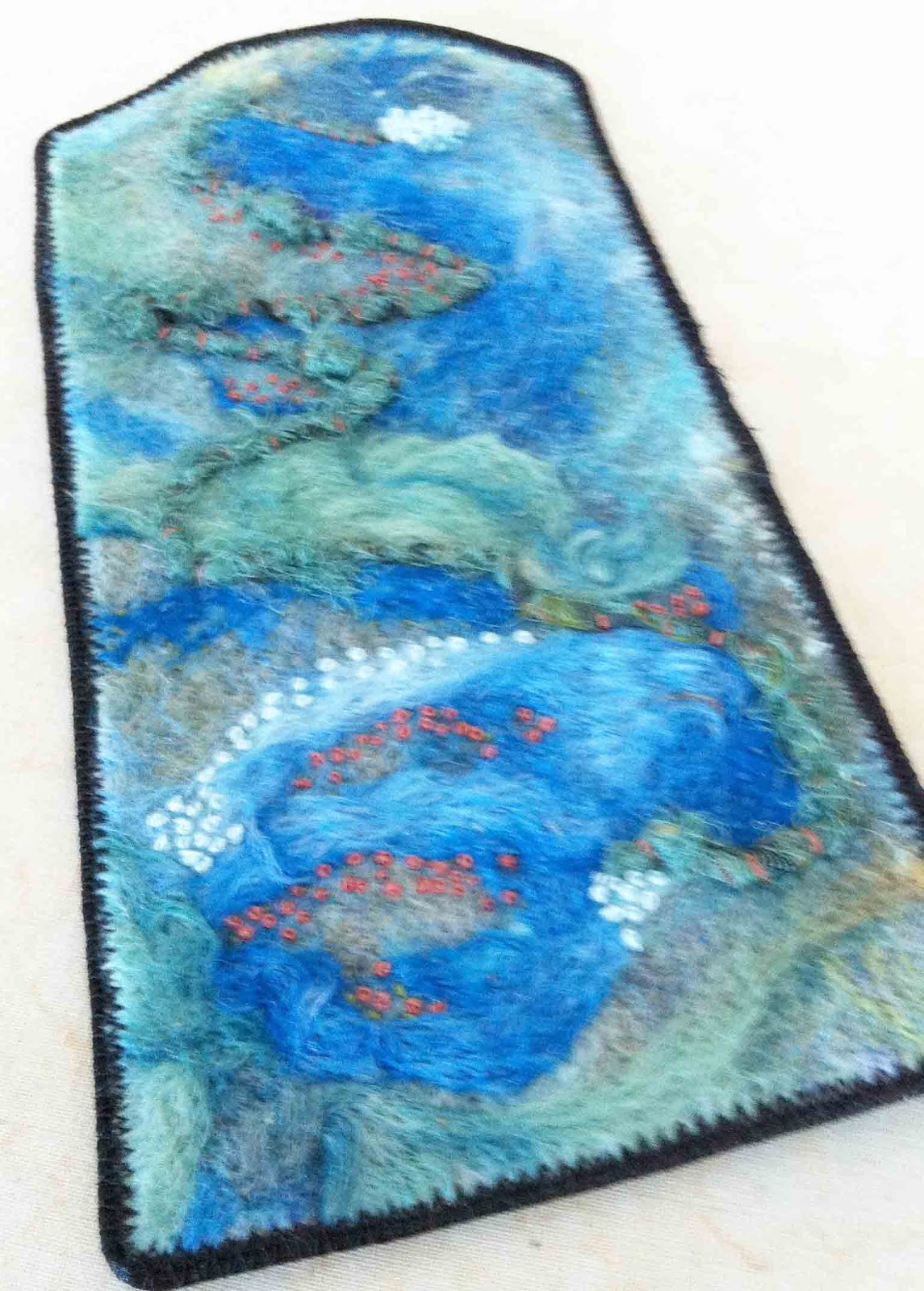
Finally, in my GOE group, it was Tracey's turn to present us with our next quarterly challenge. Her idea was to have us finish a UFO (unfinished object for those of you that might not know the acronym) without spending any more money on it.
Well, which UFO to work on...I have plenty to choose from...
I decided that I'd try to finish up all of the UFOs I have in various stages of completeness (or incompleteness for you pessimists out there!). This piece is the first one I've managed to finish up...and, I've also started three new fibre art pieces (not to mention journalling and photography 'stuff' LOL). Can you say "attention deficit"?


The tissue paper was adhered using more matte medium and when dry, I used a Pitt pen to trace over the lettering and fill it out.

After letting that dry overnight, I used a white Sakura Jelly Roll pen to add some highlights to the lettering. This is something I just figured out this week. I'd often have trouble with the white pen giving me a really nice, consistent line, even though a gave the black a few minutes to dry before trying to write over top of it. Since waiting overnight, it works like a charm for me! Who knew!
The final step was to adhere the needle felted piece to the canvas, you guessed it, with more matte medium.

Saturday, October 20, 2012
Stitch Bible


I decided to sign up for the online class and the first thing Carol suggests you do is make a stitch bible. It really is a good idea because it is surprising how different the stitches actually look compared to their little drawings on the machine.
I stitched all of the stitches for my Husqvarna Lily 555 using purple variegated thread. As I stitched, I labelled each with the corresponding number on the machine for easy reference later. I used a fine point Sharpie and just hand wrote them.


Once I finished all of the stitches, I put two pages back to back and did a simple zig zag stitch around the outside to secure the pages (and hide the bobbin stitches).

For the cover, I decided to use some fun lettering from my Letter Love class back in February (look familiar Joanne?). Here's one link to a post with similar lettering if you're interested. I love how well these lend themselves to machine applique and stitch!

To be able to quickly find the stitches for each machine, I put ribbon tabs on the first page of each section, using the same colour as the stitching.

While I was over at the sewing machine doing all of this, our cat was enjoying her new favourite spot on my new desk. She's loving that spot in front of the window as much as I do!
I still need to get some grommets so I can 'bind' the pages with a couple of binder rings and then it'll be finished and ready to use.
Subscribe to:
Posts (Atom)