
Showing posts with label Inktense pencils. Show all posts
Showing posts with label Inktense pencils. Show all posts
Wednesday, July 8, 2015
DLP Week 25: Hometown Memories...
Week 25's prompt for the Documented Life Project was 'Hometown Inspiration' with the quote 'There's no place like home.' I am working on a fibre art piece using this globe, and since I had it printed on paper I thought I'd play with it and add the quote in fun lettering. I coloured it using Inktense pencils and my waterbrush. Simple but fun this week!


Friday, May 29, 2015
Excitement Returns...
 I've got to confess, it's been a long time since I've been excited about a piece of fibre art. I seem to have been in some sort of a slump and I just couldn't seem to find motivation or excitement to produce.
Yesterday I showed you the beginnings of this challenge piece and I was initially pleased with how the brick wall was progressing. However, on further reflection I wasn't happy with how flat it looked. Out came the Inktense pencils and my water brush, as well as some music to listen too...I literally spent hours doodling and shading and I am so excited about how this is working out that I just had to pop in and show you the wall I've 'built'.


Using Derwent Inktense pencils* I began to add some shading to give my bricks more dimension.
*If you don't have these in your art supplies, you really must get some!
All that remains is a crazy amount of hand stitching...I can't wait to show you the finished piece after our group reveal on June 10th!

!
Wednesday, March 26, 2014
Variation On A Theme...
On Monday, during the StencilGirl / Lost Coast Designs blog hop I created a somewhat silly spread in my journal. (BTW, it's not too late to get in on the fun or the prizes in that blog hop!)
 Today I've decided to pull out a few other materials, namely this wonderful little coloured 'paper pocket' and a tag so that I could create a cute little variation yesterday's theme. It's all really quick funny, since I've never been concerned about birthdays or my age, but I know some people are and so the idea was born.

 I had this newsprint on which I had cleaned the dictionary stamp I used in the blog hop post while I was doing the background Gelli print. I tore a couple of pieces from it to glue to the pocket and the tag. Then using Inktense pencils, a stencil, the little black insert from doggie poo bags, and some acrylic paint I added some additional colour and texture.
Notice the drippage...drippage makes me happy!

Since all the additions resulted in the backgrounds not being totally flat, I stamped the two bird stamps on to deli paper, tore the images out, and adhered them using matte medium.
Add some magazine cut outs for the text, some fun tassels to the tag using yarns or whatever you have on hand and you've got a cute little birthday 'card' for that special friend who's celebrating the --th anniversary of their 29th birthday!
The message says, "A little bird told me it was your birthday...-but don't worry...I put an end the THAT!"
Here are the two pieces separate:


And what they look like with the tag tucked into the pocket ready to be presented to your friend!

Today I've decided to pull out a few other materials, namely this wonderful little coloured 'paper pocket' and a tag so that I could create a cute little variation yesterday's theme. It's all really quick funny, since I've never been concerned about birthdays or my age, but I know some people are and so the idea was born.I had this newsprint on which I had cleaned the dictionary stamp I used in the blog hop post while I was doing the background Gelli print. I tore a couple of pieces from it to glue to the pocket and the tag. Then using Inktense pencils, a stencil, the little black insert from doggie poo bags, and some acrylic paint I added some additional colour and texture. Notice the drippage...drippage makes me happy!
Since all the additions resulted in the backgrounds not being totally flat, I stamped the two bird stamps on to deli paper, tore the images out, and adhered them using matte medium.
Add some magazine cut outs for the text, some fun tassels to the tag using yarns or whatever you have on hand and you've got a cute little birthday 'card' for that special friend who's celebrating the --th anniversary of their 29th birthday!
The message says, "A little bird told me it was your birthday...-but don't worry...I put an end the THAT!"
Here are the two pieces separate:
Wednesday, March 5, 2014
A Little of This and That...
 I finally got around to painting some more fabric so that I can start working on the art quilt that will include all the thread doodled eyes I've been doing. You can see the eyes here, here and here if you missed them.
I've also been doing some more art journalling, preparing the March calendar spread. I'm using Inktense pencils and it's interesting to see the before and after as I work. If you're not familiar with Inktense, initially they look and feel like pencil crayons, but once you take a water brush to them the incredibly vibrant pigment is activated and they come to life!


It's also interesting to see how they react differently to different paper. This Canson journal has different textured paper front and back, so when doing an open spread like this you're dealing with two different papers. The right hand side is a beautiful mixed-media/watercolour type but the left side is a smoother bristol board like paper and it just doesn't give you the same variations in the colours. However, you can't sweat the small stuff so for my purpose this will be just fine!

Monday, April 15, 2013
Look Around...

Saturday, April 6, 2013
Just The Right Inspiration
 For a few weeks now, I've been meaning to create a journal to record my thoughts as I work through a book called Healing From Trauma by Jasmin Lee Cori (which I highly recommend if you're looking for this sort of book). Anyway, I hadn't quite decided on the format I wanted to use until my friend Kathie told me about Valerie Sjodin's art journalling. Valerie is an incredible artist and she has created a number of stunningly beautiful art journals. This gave me a jumping off point. I loved the idea of some interesting edges and flaps as well as little pages within the bigger ones.

I stopped working on the overall spread so that I could quickly finish the lower left area in which I knew I wanted to do some journalling so that I could get my thoughts down on the page.

I incorporated part of a map into the top of the page and drew a bicycle to represent my other passion, cycling, which is another vehicle (no pun intended) for allowing myself to work through issues when I just need some 'zen' time to burn energy and think. Those endorphins do wonders!
Here's the finished spread:

Thursday, March 21, 2013
Photo Art Meets Journalling

I took a photograph of the finished journal spread back into Photoshop Elements where I did a minor level adjustment and then place it onto Bonnie's 'inspiration' texture.
Friday, February 8, 2013
Polka Dot Letters and Words...
Here are a few of the fun pages I've been doing while taking Joanne Sharpe's latest online class, Letter Love 201. It's a great way to get into an art trance and just doodle!
The word collage was done on an old dictionary page. The coloured border/background is done with pan pastels.
The lettered page below, on the left, was just not popping for me, so I added some polka dots to all of the letters in my first and last name (I had to add an extra 't' because initially there was only one) and then I gave it a bit more of a colour pop too.
If you need something to pass the time, figure out where the extra letter was squeezed in on the second image. It shouldn't be too hard since you already know it's a polka dotted 't'.

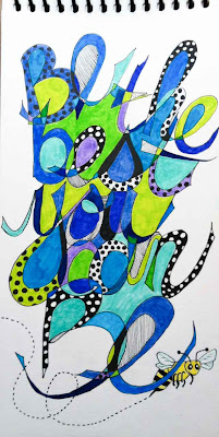
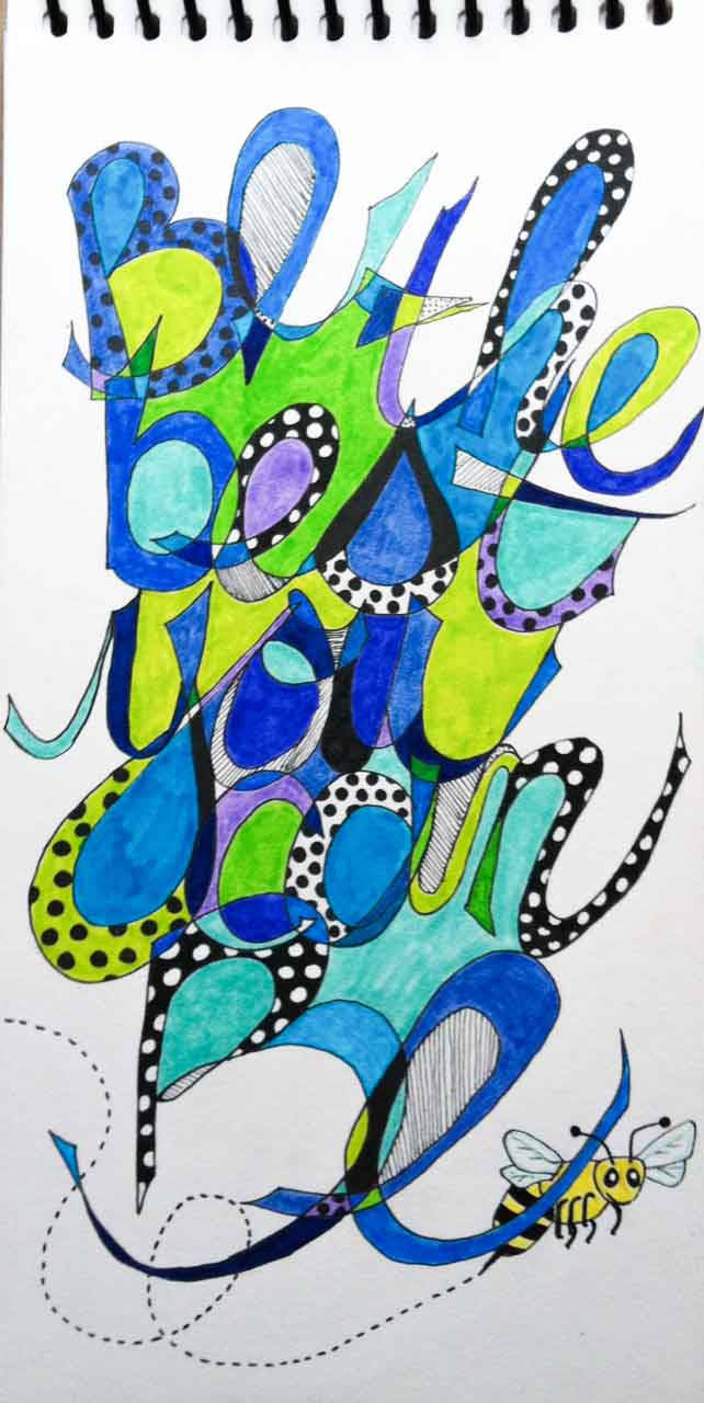
And finally this last piece for today...I think I'm getting a bit carried away with all the polka dots and the 'bee' is just way to cutesy for my usual style, but oh well...
As I look at the bee here, I don't think those little wings are going to support a bee that size. :o)
The jumbled letter piece was definitely my favourite of these three activities. I can see some potential for variations on that idea. I love the dimensionality of the layers of letters.


The word collage was done on an old dictionary page. The coloured border/background is done with pan pastels.
The lettered page below, on the left, was just not popping for me, so I added some polka dots to all of the letters in my first and last name (I had to add an extra 't' because initially there was only one) and then I gave it a bit more of a colour pop too.
If you need something to pass the time, figure out where the extra letter was squeezed in on the second image. It shouldn't be too hard since you already know it's a polka dotted 't'.

And finally this last piece for today...I think I'm getting a bit carried away with all the polka dots and the 'bee' is just way to cutesy for my usual style, but oh well...
As I look at the bee here, I don't think those little wings are going to support a bee that size. :o)
The jumbled letter piece was definitely my favourite of these three activities. I can see some potential for variations on that idea. I love the dimensionality of the layers of letters.
Sunday, November 25, 2012
Calendar Journal in the Works

In a previous post I mentioned that I was starting to work on a calendar journal for 2013. In the last couple of days I've added a bit more to the first couple of pages. As you can see, for now I'm using circles as my little journalling spaces for each day. That may change, but for now I'm just having fun playing around (oh, that's awful...sorry).
Here are a few pictures of where I'm at right now. I think they need more texture or something, but time will tell.
 I've been using a variety of media, including, pencil crayons, Intense pencils, Caran D'Ache Neocolour II watercolour crayons, gesso, a black Pitt pen and a white Sakura Jelly Roll pen.

Here are a few pictures of where I'm at right now. I think they need more texture or something, but time will tell.
I've been using a variety of media, including, pencil crayons, Intense pencils, Caran D'Ache Neocolour II watercolour crayons, gesso, a black Pitt pen and a white Sakura Jelly Roll pen.And, in case you worry about me being lonely while I work, rest assured I have my assistant very near by at most times...


Thursday, October 25, 2012
Playing With Colour

This first image is a page I did using watercolour paints and Tombow markers. It already has some dimensionality showing, but after playing a little more with my Intense pencils, pencil crayons and my trusty 'White Out' pen, I'm happy with the bright, crisp colours and the 3-D effect I've been able to achieve. Wow. To think this is just the first lesson and I'm already feeling more confident!

Wednesday, February 15, 2012
Doodle Letters
 Still loving my Letter Love 101 course, I've been doodling some fun letters. Instead of doing my name or a particular word (as the assignment suggested) I decided to create a few letters to play/practise the technique and then I made a full sized letter B and wrote a message inside it.

I used my Inktense watercolour pencils to add the colour.


The final step was to add a few accents with my trusty correction pen. I love the pop you get from that little bit of white over top of the colour!
Monday, February 6, 2012
From Thoughts and Words to a Journal Page (and a beautiful pantry!)


The rest of the pictures show the transformation from black and white lettering to the colourful finished page. I used Pitt pens and Microns to do my lettering.

Then I used my Copic markers to colour in the flowers...

...and some of the features in the grid lines.

Still using the Copics, I coloured in some of the shapes created by the letters. Here's what the page looks like with all of the marker work done. Now, on to the background.

I used my Inktense watercolour pencils. I love these pencils! You use them just like a pencil crayon, pressing as hard or as soft as you like and blending and shading as you do with regular pencil crayons. I wanted a soft background to contrast the bright pop of colour that the Copic markers provide, so I was shading lightly with the pencils.

Here's where the magic comes in. Using one of these wonderful watercolour brushes, you just paint over the areas you coloured in with the Intense pencils to release the watercolour pigment! I just keep a paper towel beside me as I work so I can switch from one colour to the next without muddying up my paint. It really only takes a little dab on the paper towel and you're ready to go. This makes the Inktense pencils perfect for travelling since you don't need a water jar for cleaning your brush!

I just love how the colour pops as you brush over it with the aqua brush! By the way, Inktense comes in various sets (in wonderful tins) but they also sell individually. That means that when you eventually use up a favourite colour pencil (they last a long time) you can replace just that one colour that you need.

Okay, so here's the crazy thing...the other day we went to the Bulk Barn and stocked up on all the various flours and other 'stuff' required for gluten free bread baking (that's a whole other story which I won't get in to here). Gone are the days when I could just have a bag of "all purpose" flour in the pantry. Well, as you can see from the photos below, everything kind of looks alike so I organized them into mason jars and labelled them. Well, thanks to Joanne's influence I couldn't just write plain boring labels could I??? LOL Thanks Joanne, my pantry looks "Letter Love"ly!


Subscribe to:
Posts (Atom)