Showing posts with label journal. Show all posts

Wednesday, September 11, 2013

Another Journal...

As I may have mentioned in the past, my fibre art group makes journals that we donate to our local women's shelter as a way of giving something back to the community.  Each of us commits to making three journals, so that we can donate a total of 30.  I've made several journals in the last couple of months, but they keep finding homes!  And so I've had to make another one so that I have three ready to go for our deadline this month.

 I used some of my hand dyed fabric, but I wanted to add a bit more of a graphic element so I did some surface design by using Jane Lefazio's Eucalyptus stencil and some acrylic paint.
I love the added texture.  Obviously I was in a circle mood so I cut lots of circles and rings from the fabric.

         
I'm almost sorry that I used this fun piece of a wipe up rag as the lining.  the more I look at it the more I wish I'd used parts of it in a piece of art rather than as a hidden lining!  Oh well, there will be more wipe up rags...


After fusing the circles and rings to the background I did some zig zag top stitching and called it done.


And here's 'Chain Link Journal'.  May it bring hours of drawing, writing, or journalling pleasure to it's new recipient!

Friday, November 9, 2012

Playing With Circles

Today I started working on a background for the first page of a calendar journal that I've decided to make for 2013.  My goal is to work on the start of the backgrounds in the next couple of months, so that when the new year arrives I'll be ready to add the writing into each days designated spots.  As you can see, I've started with circles for January.  I have no real plan yet, other than to do it, so we'll see where it takes me...

Tuesday, September 11, 2012

More Faux Tie-dye and Journals

Sadly some sort of a computer glitch has caused all of the images in this post to disappear, and I am unable to correct the problem.  Sorry!
The other day I shared a fun little tutorial about faux tie-dying and I showed you some of the journals I made using my little 'masterpieces'.  Well, yesterday I got the Sharpies out again and I did some more tie-dye circles.  This time I tried using various two and three colour spirals and some other shape and design ideas.  As I suggested in the other post, I recommend that you just experiment and have fun.  I was quite surprised by some of the results.

 I again used some of the circles I made, along with my hand-dyed fabrics to make some more journals.  On this one I used a piece of green ribbon to create a line and then decided to add some thread sketching to turn the circle into a flower.
This journal has wide strips of hand-dyed cheese cloth woven loosely over a plain blue background.  I love how the cheese cloth allows you to see through to the other colour.  Three random tie-dye circles were stitched over top to add a bit more interest.
On this journal I used a piece of accent fabric that I created while doing some surface design (click here to see that post).  I used a couple of pieces of coordinating ribbon and then had fun with some free motion quilting using variegated thread.  I used narrow horizontal zigzag quilting along the right side of the journal cover and then switched to a much longer vertical zigzag to cover the rest of the journal cover, front and back.  I had planned to add a tie-dye circle somewhere on this journal, but once I had this much done I decided to leave it as it was.


Saturday, April 21, 2012

Bead Journal Project: April

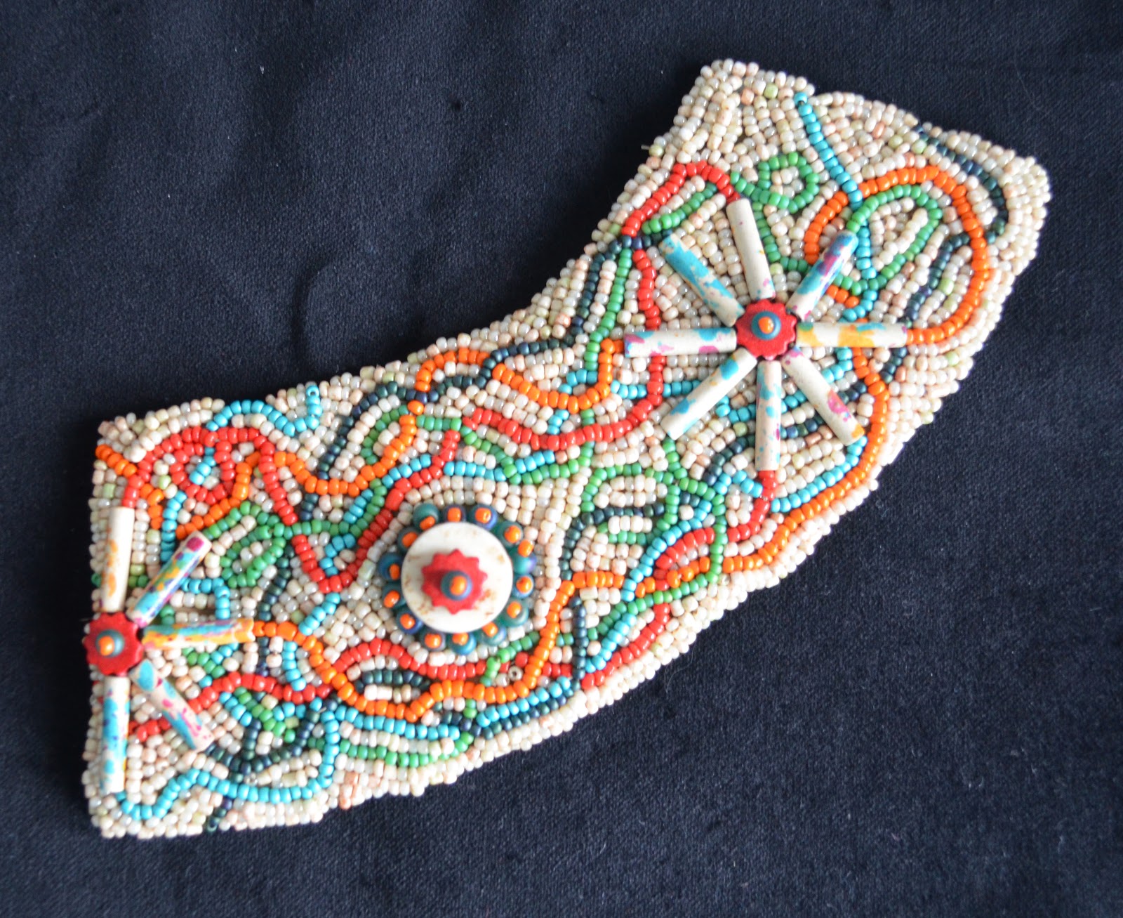
Well, here it is just past the middle of April, and my Bead Journal Project piece is done!  As you may remember, I am taking my colour inspiration each month from Vicki's Colour Palette Challenge, and this month the colours came from mouldy pie.  Yes, you read that correctly.  As disgusting as it sounds, the colours are actually wonderful.
I started with some fun bugle beads that were the perfect colour combination as well as a piece of whale bone that my friend Heather bought for me a couple of years ago while she was visiting my cottage.  The spokes represent my bike since I try to cycle about 30-50 km (19-31 miles) each day, and the whale bone represents the centre hub of the wheel with the chain circling the gear. 

I then made a bunch of meandering paths to represent the various routes I cycle, to give it sort of a map view. 
Once the paths were complete I just filled in all of the background area with the neutral coloured beads.


And, here's this month's finished piece.


 Four months done and eight to go...

I love how the spiral is coming together.  I'm starting to think about how I will mount this for hanging since the beads are pretty heavy and once the twelve months are complete the total weight will be significant.  Oh well, I've still got eight months to worry about that. LOL

Saturday, April 14, 2012

A Little Rain Must Fall


Today while waiting for bread to rise I had some fun creating another journal page.  I used a background spread I had done a while ago and added a wonderful quote by Longfellow.  Considering the grey clouds outside, it just seemed like a good choice.  I started by adding an umbrella cut out of a page of text and then I added the quote.  


Because I often end up leaving out words as I write, I thought it would be safer to write the quote in pencil first and then go over it with my Pitt pen.   


And finally, the finished piece, complete with a few clouds and raindrops.  It's hard to see in the photo, but the raindrops are made with metallic pens which give them a bit of shimmer.  If only all rainy days could be this bright and colourful!

Monday, April 2, 2012

Bead Journal Project: March

Well, this month (or rather last month since it's the piece for March) I actually finished beading on time, but I'm still a little late posting.

I started with 5 'snowflakes', my interpretation of the Whistler/Blackcomb symbol and the three copper beads to represent three nights spent at the resort.  I then filled in the background of that area with the random beading in the yellow, gold and orange beads.  I wanted the snowflakes and resort icon to be subtle.

Since I don't plan these bead pieces, the rest just evolved section by section as I played with adding various rows, spirals, etc.


Finally, here are the first three month's pieces shown together.  You can begin to see the spiral developing.


Sunday, March 11, 2012

Preparing a New Journal to Go

 I've been preparing a new journal to take along with me on a bit of an 'escape'.  I started with 9" x 12" sheets of watercolour paper.  I folded them in half (one at a time to get the best crisp fold), nested them into one another and then sewed them together by stitching down the centre fold on my sewing machine (I used the longest stitch possible and a good strong thread).

The next step was to pull out some stencils and my watercolour paints and just start to play.

I love the tone on tone effect of these numbers overlapping one another in various shades of aquas and blues.


This page got a bit dark at one point so I used a dampened paper towel and brought it back to what you see here.  I also like that it resulted in softer lines and shapes.
 I started this page by stamping the stamp using a deep brick coloured stamp pad.  I inked the stamp once and then stamped it five times, letting it gradually fade out as it went up the page.  I then reversed it on the facing page so that the dark image is at the top fading down to light.
 This page was all about creating lines and streaks in those beautiful pink tones.  I can see using some of those lines for some beautiful lettering.
 I see some Van Gogh 'Starry Night' coming out of this page.  I went a little further with this page, already adding some more stamping to get more texture.
 Simple pale blue with a bit of brown stamping.  I love that stamp!
I'm craving a Tequila Sunrise...hmmm, I haven't had one of those since my misspent youth! LOL
 I was playing with colour mixing here, but the green really didn't come through as much as I might have expected.
Not sure what happened here, but this page might end of being a close-up of some weird face or something.  I feel some funky eyes looking at me...
More stamping and a fun bit of striped gaffer tape on the spine of the journal.  

The next step is to add more elements, texture, stamping, etc. to the pages before I actually start to journal.  Of course, it's been made to fit perfectly into my 'Journal on the Go' cover so I can take it with me while I'm travelling, pens, markers, homemade washi tape and all!

Friday, February 24, 2012

Recycling An Old Pair of Jeans = Journal To Go!


I've had an old pair of my husband's jeans lying on the studio floor since I used a bit of the denim in a piece of mixed-media art that I'm working on.  Today, as I glance down at them while doing something else I suddenly got a great idea.  This is where my husband would say, "Self praise is no praise." but I really do think it's a great idea :o)

I used the back of the jeans, pockets and all to make a journal cover.  It has a pocket on the front and back to hold a selection of your pens, markers, your aqua brush, etc.  You could even fit a few small rolls of washi tape (see note at end of post and click here for a DIY for making your own washi tape) in the pockets.  I used a bit of left over upholstery weight cotton to add a pop of colour.
Now you've got an easily portable journal so you can do "art every day" no matter where you are.  Wouldn't this be great on a long plane trip?  Australia is on my bucket list and the idea of being able to journal along the way would certainly make the long flight seem to pass faster.
I also found a bit of time to make a birthday card for one of my great nieces, so it's been a good day!
Note:  Someone in my Letter Love 101 class shared a wonderful link on making your own washi tape.  It's absolutely brilliant and so easy!  

Thursday, February 16, 2012

Better Late Than Never...

With Valentine's Day being on Tuesday and the Letter Love 101 course, I wanted to play with hearts and a 'love' message.  I started by making a large heart frame using zentangle type doodles.  Inside I wrote the quote and drew a few 'heart flowers'.

The next step was to add a textured background, again falling into the Zentangle style to create a sort of quilted effect.  I added a little shadowing with a grey Copic.
Finally I added some colour.  I lucked into a great deal yesterday when I went to visit my Mom in Kitchener.  I stopped by the Creative Sewing Centre and discovered that they were going out of business.  As such, they had everything in the store on sale.  My best find was the All Purpose Inks for Fantastixs by Tsukineko.  They had all sorts of wonderful colours all for 70% off!  I bought 22 different colours!  I used pinks and reds to colour this page, along with using Copic marker and Le Plume II markers. 

Wednesday, February 1, 2012

Letter Love Journal

I'm taking Joanne Sharpe's online course called Letter Love101 and our first assignment was to ready our composition book by gluing pages and decorating the front cover.  Here it is!  I had great fun doodling with a black copic marker, a Pentel correction pen and then using some red duct tape to give it a little colour.  It's not to late to sign up for this class.  Click on her link and check it out.  It promises to be a lot of fun!

Saturday, January 7, 2012

Altered Book / Journal

An old credit card was used to scrape
the paint.  Also added tissue tape in a
long strip and short pieces (these had
a calendar on them).
A while back I started playing with the idea of altering a book to make a journal.  My first obstacle was to overcome my horror of defacing a book.  Having said that, I decided that using an old hardcover (fiction) picked up at Wastewise (a wonderful recycling depot in town) wouldn't be too terrible (unless of course you are the author, in which case I give you my sincere apologies).

The first step was to remove some of the pages (randomly throughout the book - not all from one section) to allow for the added bulk that the paint would add.   I then glued together 3 pages at a time and stitched around the edges using a zigzag stitch on my sewing machine.  You can get to within about 1 1/2 - 2 inches from the binding.  This gives you good sturdy pages with which to work.
Brick pattern was created using a stencil.  
Circles (look like page reinforcers) were
made using the wooded handle of an old
foam brush (remove the foam and plastic
part and you're left with a short dowel 
with a hole in it!

The next part was the hardest for me because it required a lot of time and patience.  I covered each page with gesso, but because you don't want the pages to stick together you have to wait for each spread to dry before you can go on to the next.  At this stage I used a light covering of white gesso, allowing some of the original text to show through.
Stamping was done using rubber
stamps with acrylic paint. 


Inktense pencils give wonderfully
vibrant colour.


Now the fun begins.  Using acrylic paint, Inktense watercolour pencils, markers (I like Copic markers), white gel pens, black gesso, etc. I began to play.  Again this takes patience because you have to wait for pages to dry before you go on to the next spread or before you can begin to journal on the fun backgrounds that you've created.

Background ready for some sketching 
and journaling.
I love using white printing on the black gesso for a change of pace.  I really like the effect.  (Note: I found my white gel pen worked much better on the black gesso than it did on black acrylic paint.  I also like the more matte finish of the gesso.
Markers were used to colour in some 
doodles on this page.

Saturday, December 10, 2011

Sketchbook Challenge Journal

As you may know, I've been participating in this year's Sketchbook Challenge, but with my own fibre twist.  Although I have recently started playing a bit with a pen and paper sort of journal, when the year started and I decided to participate in the Sketchbook Challenge, I decided to make a fabric journal using my interpretation of the monthly themes.  In addition to the Sketchbook Challenge pages, I decided to include some of the wonderful art quotes that I had collected.


You may have seen some previous blog entries as I finished pages, but the last 6 months were sort of neglected.  Well, I finally got back into it (art everyday!) and the journal is finished.  All of the images were altered/enhanced using Photoshop before being printed onto fabric and then incorporated in the journal page.
January's theme was Highly Prized.  Casey, my dog, represents the unconditional love and natural mothering instincts (even to a kitten) that I prize.  She knows how to relax, loves to go for walks and even at 11 years old, she romps like a puppy in new fallen snow.


February's theme was Opposites.  For this one, I played with light and dark and experimented with the effects that changing the background colour would have on the colours I was using.

March brought the theme Spilling Over.  It also had me struggling through some real frustrations with my health and the image literally represents what was going on with me.  Enough said.
Branching Out/Out on a Limb was the April theme.  I decided it was time to take a risk and try journalling on paper.  I drew a silly character, did some writing then photographed it.  I added the title text in Photoshop and it was ready for printing.

May's theme was Resists so I went back to using paper and paint for this page.  As always, I added the title text in Photoshop.
The theme Pathways for June had me playing with photo collage.  Yes, that's me as a little girl, but since our road trips involved 9 people when I was a kid, we travelled in a big station wagon and not a VW bug.  However, later my oldest brother did have a bug and it's just so much more fun than a Galaxy station wagon!

 July's theme was Elements. Since I procrastinated on this page, it wasn't done until recently, thus allowing me to use a photo I took of my Chinese lantern's late this fall.  I love the intricate lace and the bright orange seed exposed inside as the orange skin erodes away.
 For August's theme, Everyday Objects, I cheated a little by taking a photo of a piece of fibre art I had recently finished on which I had thread sketched a pair of scissors.  I guess it's not really cheating since the original art is mine too!

September brought the birth of another great niece.  The theme was Unfurled, and I couldn't help noticing that the first photos of Abigail had her fits tightly clenched but as time passed her little hands seemed to unfurl.  
October's theme was Views.  This theme had me going back into my photo archives for this photo which I took in a church in PEI in 2007.  I love the reflections and shadows that the design in the window created.
Imaginary Animals was the November theme.  Last week I went to see the Marc Chagall exhibit at the AGO (Art Gallery of Ontario).  Chagall seems to incorporate a chicken in many of his pieces and he had other interesting animals, some certainly imaginary.  When I got home I was inspired to draw this imaginary creature using the bright colours Chagall used in some of his works. I also loved the quote, also by Chagall.

December's theme is Trashed, Ruined and Decay.  This summer, the town of Magnetawan suffered a tragic fire that ruined the old historic general store as well as June's Restaurant.  For the town folks and all the cottagers in the area, it is a tragic loss.
And the final quote.

Thanks for visiting!  Please leave a comment~I love to hear from you.