Showing posts with label text. Show all posts

Monday, April 6, 2015

DLP Week 14: It's Water Under the Bridge...

This week's DLP challenge was to explore watercolours and the challenge quote was 'It's water under the bridge.' I decided to stay away from anything too literal but still wanted to keep to the theme of the challenge.  


As I do each week, I used washi tape and some collage components to create my calendar/journalling area. This way, even if I don't get to the art on the rest of the page right away, I can still record my daily entries at the end of each day.


I used additional washi tape to create a border around the remaining part of the page spread.
Searching the Internet, I found this wonderful butterfly that I was able to resize and print in a variety of sizes. I used Tombow markers and my waterbrush to colour them. I then layered the larger ones with a piece of old sheet music and a map page from an old atlas so that when I cut them out I'd have three layers.
 I had a lovely piece of tissue paper with script on it, so I stabilized it with some fusible interfacing, misted it with a spray bottle and then painted it with a variety of Winsor & Newton watercolour paints to create a beautiful, watery wash.


Once the background had dried, I took my layered butterflies and the background sheet over to the sewing machine-this is why I had to stabilize the tissue paper.
I machine stitched the butterflies to the background sheet by sewing over the body of the butterfly, leaving the wings free.

This was then glued into my journal, leaving the border to show around the edges of the 'water'.


I think this is a beautiful quote.

"Perhaps the butterfly is proof that you can go through a lot of darkness and yet become something beautiful."

To me it ties in to the idea of the past being water under the bridge...it doesn't have to undermine the beauty that we can still have within us.


Monday, March 16, 2015

DLP Week 10: Make Your Mark

I've got no process or description this week, just the spread as it stands on it's own, intentionally 'scratchy' and quick. 

As always, it's not too late to join the FREE Documented Life Project fun!

Monday, June 30, 2014

Heart Swell...or puff...

I've decided to do a series of small pieces using my hand dyed fabric and various techniques, all incorporating hand stitch.

This piece is starting with a heart stencil designed by Margaret Applin.
Using a palette knife, I applied a nice thick coating of Pebeo Expandable Paint through the stencil.  Be sure to keep the stencil firmly held onto the fabric so that you don't get any paint under it.  I used a temporary spray adhesive to achieve this.
Let dry according to paint directions and then 'puff' using a heat gun.

I'll show you more once I get to the hand stitching. Have a great day!

Wednesday, May 7, 2014

Fun Found Items...

The other day I was going through some things and I found a bag of goodies that my friend Jan gave me at a Christmas get together.  Inside was this package of Scratch to Draw paper.


I reached for my high tech tweezers, usually reserved for fine manipulation of tiny things...but they were the first pointy item I got my hands on and I knew they'd be great for scratching into the paper (they stick mentioned on the package seems to have gone missing!).


I used Carolyn Dube's buildings stencil because it has a nice variety of interesting blocks. I was thrilled with the bright colour and the effect of the tweezers scratching into the black looked great (in my humble opinion LOL).


 I made a variety of different sized 'building blocks' :o) and then stacked them in a finely balanced arrangement.  I played with various background ideas, but in the end I decided that I liked the contrast of the blocks on the white page so I left it as is.


I added some text, a bit of shading and a simple doodled border and called it done!


Friday, March 21, 2014

The Text Is In Place...

The text is now in place and I'm ready to do a bit of thread doodling and then some hand stitch before I finish with the final machine quilting on this piece.
I ran into a bit of trouble when I was removing the paper backing from the painted fusible. I'm not sure if it was because I didn't water the paint down enough or if it was old fusible or some other issue.  I'll have to do some more experimenting with this technique to figure it out.  But for now, I'm ready to go with the next stage of the process.


Wednesday, March 19, 2014

Adding Text...

I've decided on a title, 'The Secrets Within', and I'm ready to add some text to the 'eyes' piece I've been working on for the last while. The first step was to paint some 'Wonder Under' fusible webbing.  I learned this technique from Linda Kemshall on DMTV. 


One of the nice things about this technique, which is really only suitable for larger text, is that you don't have to worry about reversing your words/letters which makes it easy to trace your text, cut it out and then apply it to the fabric.  


I cut the letters out while listening to TV but now I'm thinking I should have had a more organized system (other than a bin in which I dropped all the letters) so that I would have had an easier time of sorting the words and putting the text on the actual quilt top. Oh well, maybe next time...

Hopefully I'll be ready to show you the next stage on Friday.  Until then...

Saturday, May 25, 2013

An Original...this could start a trend!

As you know if you've been following my blog, I had a cycling accident recently that has left me in a cast (details here).  The plaster cast was replaced by a fibreglass one at the fracture clinic on Thursday, and while talking to some of my art friends later that day, a crazy, silly idea came to me.  
Karen Ellis at The Art House Studio does a live Ustream every Friday evening in which she does some sort of wonderful painting or mixed-media piece of art while chatting live with her viewers, so I thought it would be fun to challenge her with an unusual 'canvas'.

The result is fabulous!  We joked about putting her business card in all the area fracture clinics to drum up business!  
I have a wedding to attend on June 6th, so we also joked about needed it to be 'elegant' and I worried about what I could wear with it.  That's when Linda/Rappy suggested that I could dress it up with pearls.  Well, I don't have any pearls, but I did audition a few alternatives. LOL What do you think Linda?


Because of the cycling accident, Karen thought it needed a bicycle on it!  What you can't see is all the collage bits from a cycling map, that ironically even includes bits of the actual rural roads on which I was cycling that fateful day.  There's also dictionary text including 'bicycle' and 'crash' as well as some safety tips and cycling etiquette.  My favourite is the bit that says "Don't litter" (especially Gatorade bottles!!!).

You can watch the recording of the Ustream video here.

Karen, thank you so much for being such a great sport!  What a fun art experience!

Friday, May 24, 2013

Rust

The rust piece is finally finished!  I learned while finishing it that apparently I would prefer to thread my machine left handed, but the cast wouldn't let me get close enough.  As I tried it just went 'clunk' against the machine, so I was forced to use my right hand.  LOL  Thankfully the actual machine sewing process isn't hampered too much by the cast! In spite of the challenges I encountered working with the rust dyed fabric (you can read about it here, and more about how the piece began here), I think I'll work with it again because I'm really pleased with the finished piece.

Here are a few close up images of the piece:


Linking up with Off The Wall Friday.

Wednesday, April 24, 2013

The Journey Continues...

A couple of weeks ago, I started a journal (you can see the first post here), and today I have finally finished the second spread.  The journey is all about thinking positive thoughts and moving forward on a healing journey.  I can't think of a better way to do that than through art!


You can see a couple of the stages the page went through as I worked on it.  I just love seeing the transformation as colour and shading is added to the page.

I use a 0.005 Micron to do the actually journalling on the page once the art is done.

My writing is super tiny, but it allows me to get a lot of thoughts onto the page and work through the many things I've been reading and thinking about.  I also like the added texture that the background text gives the page.  It's a great way to make a pretty looking spread (if I do say so myself) while keeping the 'heavier' underlying text from taking over the page.


Monday, March 18, 2013

Water and Ice...


I took this photo a few weeks ago while exploring along the Bruce trail.  It was a mild winter day, and the textures in the ice and the water were stunning.  I did a couple of very minor adjustments to the levels and contrast and then I added a subtle gradient mask to get a bit more of the sparkle back in the water without loosing the definition in the ice.

I added a layer of Kim Klassens "cool grunge' texture using a hard light blend mode at 15% and then finished off by creating a soft frame using an inverse selection and adding a colour adjustment at a low opacity with a soft light blend mode.

The final steps to the edit were to add the quote and my signature.  The quote uses 'Journal' font.

As much as I like the beauty of the ice and snow, I look forward to images of Spring, hopefully in the very near future!

Linking up with Our World Tuesday, Texture Tuesday, and Sweet Shot Tuesday

Sunday, March 10, 2013

Better Than A Groundhog...

Yesterday was a spectacular day...Spring is in the air and the temperature was up around 5ºC so I spent a few hours outside 'strolling' with Casey, our golden retriever.  Casey has always loved playing in snow and burrowing her face in it.  Ever since she was a puppy (she's getting close to 13 yrs. old) she signalled the start of Spring for us by insisting that she walk in/on all of the snowbanks.  Last week she was content to walk on cleared sidewalks, but now she has to have her feet in the snow.  It's as if she knows that it will soon be gone and she has to enjoy every last bit of it. Like I say, she's been doing this since she was a puppy...she's more reliable than the groundhogs as far as I'm concerned!


In addition to spending time outside enjoying the weather, I also worked on this art quilt for a few hours. I'm really pleased with how it is coming along.  You can see I've been sewing the painted Lutradur text onto it, word by word.  I've been working from the bottom and therefore have to recreate the message backwards as I go.  My cat was 'helping' by knocking words to the floor and just generally mixing them up for me, so for the time being she has been banned from the studio.  I'm having enough trouble and have to constantly re-read the statements as I go to ensure they're making sense.


And, as things go, the longer I work at it the less things sound right so I've had to walk away from it for now.

Sunday, March 3, 2013

I Love This Little Bird...

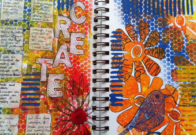
Another spread created after watching one of Nat Kalbach's jumpstarts.  I really like this idea of layering texture onto sponge stamps.  I think I got a little carried away (okay, a lot...) with the sequin waste, but as a record of the technique, it works.  I love the new bird stamp I got the other day.  I love anything with text on it so when I saw him I just had to have him.  And, again at 50% off, I don't even feel guilty!

Sunday, August 19, 2012

Vintage Fun

This week I've been playing around with some vintage looks in my photos.  The first is a shot of an old Underwood typewriter I took at the Sundridge pioneer log cabin.
Mouse over photo to see the 'before' image.
I've added some layers of textures, including some with text, using some of the ideas I've learned in Kim Klassen's Beyond Layers.

This second shot was taken a couple of years ago in a bakery in Guelph.

Mouse over photo to see the 'before' image.

Monday, May 21, 2012

One Photo - Three Ways

I've spent some time this evening playing with a photo I took a few days ago with my iPhone.  I have a fabulous new Nikon that I got for Christmas, but my iPhone is always with me and so it seems some of those unexpected shots are captured when I have no intention of taking any pictures.  Thank goodness the iPhone has a decent camera!

The one problem I find with the iPhone camera is that often when the flash goes off the photo ends up being very foggy looking.  However, this particular shot resulted in a crisp, bright centre and the dark edges that I quite liked.  I added Kim Klassen's new texture 'epiphany' and a bit of a subtle border, but it really didn't need much processing.

On this next image, I decided to play with some filters and then I made multiple copies, each time 'grabbing' the corners and transposing them to create this abstract version.


This final image is my favourite.  I was playing with several of Nancy Donaldson's textures, layering them and playing with the blend modes and opacity.  I also experimented with adding a hue/saturation layer in which I changed the colours from the original.  Finally, I added one of Jerry Jone's textures which included some text.  I love the text that subtly shows through as well as the vibrant colours.  I think this would make an amazing substrate for journalling or perhaps some hand stitching and beading in a fibre art piece.  I suspect you will be seeing this piece again, in one form or another.

Saturday, April 14, 2012

A Little Rain Must Fall


Today while waiting for bread to rise I had some fun creating another journal page.  I used a background spread I had done a while ago and added a wonderful quote by Longfellow.  Considering the grey clouds outside, it just seemed like a good choice.  I started by adding an umbrella cut out of a page of text and then I added the quote.  


Because I often end up leaving out words as I write, I thought it would be safer to write the quote in pencil first and then go over it with my Pitt pen.   


And finally, the finished piece, complete with a few clouds and raindrops.  It's hard to see in the photo, but the raindrops are made with metallic pens which give them a bit of shimmer.  If only all rainy days could be this bright and colourful!