Wednesday, October 31, 2012

Bead Journal Project: October


Vicki's colour palette this month was an interesting surprise.  I guess I was thinking all things October and expected to see oranges, reds, yellows...the colours of changing leaves, pumpkins etc.  However, that is not what Vicki had in mind.  I wasn't sure where I wanted to take this piece, but I liked the original design in the image Vicki used so I decided to essentially stretch it and make it fit my shape for this month.  

My husbands birthday is in October, and this year was a milestone birthday so I've also subtly included his age into the piece using stylized numbers.


And here is the full year's spiral in progress.  It's really coming along!  Hard to believe tomorrow will already be November.  Where has this year gone?


Monday, October 29, 2012

Fisheye Fun...

This week I had some real fun playing in Photoshop.  I'm pushing myself to learn more about what I can do with the program, applying things I'm learning from various sources including Beyond Layers and through reading online information from Adobe.  I started with Bonnie's 'cobblestone road' texture. I added all of the coloured balls from a journal page I did by using the clone tool and then making additional copies of some of them, resizing them, changing their colours using hue/saturation adjustments, etc.

Once I had done that, I decided I needed a focal point so I opened the photo of a gull that I took in the spring and I used the quick selection tool to isolate the gull (by doing an inverse selection and deleting the background).  Once I put the gull in it still wasn't speaking to me so I decided to learn how to do a fisheye effect.  Instead of using a black outer frame, I selected a dark gray colour from the cobblestones and then played with the opacity of the layer so that the balls and cobblestone still came through.

I added a gaussian blur to the edge of the fisheye.  Because I had squared off the image after putting the balls on the background layer, I had lost the lovely framing that Bonnie's texture had, so I added another layer of the texture on top, adjusting the sides so it was square (sorry, I can't remember the blend mode I used on that layer).  The final step was to add another very subtle layer of blur to the entire image and then use my round signature brush on the blue ball in the bottom right corner.

These photos are being linked to Our World Tuesday, Texture Tuesday, Sweet Shot TuesdayPhoto Show Off This or That ThursdaysPhoto Art FridayShoot, Edit, SubmitFabulous Friday, and Photo Friday Link Party.

I'm Putting On My Own Spin...

...or should I say spiral to Carol Ann Waugh's idea for a 'stupendous stitch' piece.  As I mentioned in a previous post (see here) I signed up for the Stupendous Stitching online class and created my stitch bible.  The next step was to start playing...

I started to couch various cords and ribbons onto a wonderfully bright piece of batik. I love spirals, so I just had to add some of them to this piece.  Not following the instructions of having lines going from one edge to the other, but that's just the way I am.  When I play with line spirals just seem to appear...


Here's another picture after I've added a variety of the fancy stitches that my machine is capable of.  Notice that even more spirals seem to have appeared.  :o)

And this is where I start to really have fun...

I'm taking this in a much different direction than what Carol Ann Waugh does since although it's a fun idea, I have to make it truly my own piece.  It may take me a while to finish, but I'm really excited about the direction I'm going with this.  Stay tuned to see the finished piece...I will post it when done, but that won't be for a while...

Have an ARTfully great day and thanks for visiting!

Thursday, October 25, 2012

Playing With Colour

I decided to sign up for Joanne Sharpe's Color Love 101 in an effort to learn more about using some of the wonderful, colourful watercolours, markers and other media I have in my studio.  I've always been a little afraid of watercolour paints in particular, so I hope that this gives me some knowledge about how to make the most them.

This first image is a page I did using watercolour paints and Tombow markers.  It already has some dimensionality showing, but after playing a little more with my Intense pencils, pencil crayons and my trusty 'White Out' pen, I'm happy with the bright, crisp colours and the 3-D effect I've been able to achieve.  Wow.  To think this is just the first lesson and I'm already feeling more confident!


Tuesday, October 23, 2012

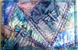
Fibre Art Postcard


Today I received a beautiful piece of art in the mail...the perfect way to brighten up a dull, rainy day!   A big thank you to my cyber friend, Jean, who suggested we swap a fibre art postcard.  If you'd like to see more of Jean's wonderful work, check out her website, Uncommon Cloth, where you can see her gallery of fibre art and mixed-media work going back several years.  She also sells some beautiful cards in her Etsy shop (links on her webpage).

Monday, October 22, 2012

The Charm of Old Rust...

I don't know what it is about old, rusty things that attracts my attention, but I think there is something about their mysterious history and the stories that lie within that call me to them.  Fortunately I've always got my iPhone with me when I'm cycling because I tend to see a variety of old vehicles, barns and outbuildings, in various states of disarray on the back country routes I travel.


Thanks to Jerry Jones at Shadowhouse Creations I have some wonderful 'grunge' textures that further add to the fun of these images.  The other source of today's fun photo embellishments is Fuzzimo, where I found the great old polaroid frames.


I've included the original images (click to enlarge) I took so you can see the difference after my processing in Photoshop Elements 9.


Bonnie, thank you for the wonderful prompt this week.

These photos are being linked to Our World TuesdaySweet Shot TuesdayPhoto Show Off This or That ThursdaysPhoto Art FridayShoot, Edit, SubmitFabulous Friday, and Photo Friday Link Party.

Saturday, October 20, 2012

Stitch Bible

For the last week or so, I've been stitching out all of the decorative stitches on my two sewing machines.  This is something I had planned to do when I got each machine.  But, best intensions being what they are, there were always more fun things to work on in the studio.  It took the inspiration of seeing a beautiful piece of fibre art done by my friend Diana to finally get me working on this.  Diana had made her piece following an online workshop called Stupendous Stitching by Carol Ann Waugh.


I decided to sign up for the online class and the first thing Carol suggests you do is make a stitch bible.  It really is a good idea because it is surprising how different the stitches actually look compared to their little drawings on the machine.


I stitched all of the stitches for my Husqvarna Lily 555 using purple variegated thread.  As I stitched, I labelled each with the corresponding number on the machine for easy reference later.  I used a fine point Sharpie and just hand wrote them.
I used a variety of background 'page colours' just to keep it interesting as I stitched.  These 'pages' are stabilized so that the decorative stitches come out properly.


I then switched to pink thread for my Husqvarna Sapphire 750.  The funny thing is that I decided to use the purple and pink because they really aren't my colours.  The ironic thing, however, is that whenever I refer to this stitch bible I'll be looking at those colours.  'sigh'


Once I finished all of the stitches, I put two pages back to back and did a simple zig zag stitch around the outside to secure the pages (and hide the bobbin stitches).

For the cover, I decided to use some fun lettering from my Letter Love class back in February (look familiar Joanne?). Here's one link to a post with similar lettering if you're interested.  I love how well these lend themselves to machine applique and stitch!

To be able to quickly find the stitches for each machine, I put ribbon tabs on the first page of each section, using the same colour as the stitching.


While I was over at the sewing machine doing all of this, our cat was enjoying her new favourite spot on my new desk.  She's loving that spot in front of the window as much as I do!

I still need to get some grommets so I can 'bind' the pages with a couple of binder rings and then it'll be finished and ready to use.

Tuesday, October 16, 2012

Pink Passion...

This beautiful ATC, called "Pink Passion", arrived in my mailbox today.  It was made by Robbin Neff.  If you want to see more of her ATCs, click on her name to see her blog.  I've actually linked to the post about this particular ATC, but you'll be able to explore further from there.
Robbin and I participated in an ATC swap organized by Lisa Fulmer, but sadly Lisa has decided that she's got too many other things going on so she won't be doing any more of these swaps.  Thanks for doing it while you could Lisa.  It was fun and I appreciate all of your time and organization.  
Maybe I'll have to think about picking up the ball...??? 


Monday, October 15, 2012

Look Up...Way Up...


Kim's challenge this week for Texture Tuesday was to have us looking up.  This is the perfect time of year for this as the colours in the autumn trees are spectacular!  I added three of Kim's textures to this image: Just Stitched, Trust, and Warm Sun.  I love that bit of zigzag 'stitching' at the sides. I brushed away some of the texture from the centre of the image so that the colours of the leaves were a little more intense in the centre.  


This next image, of my dog Casey snoozing on the dock, was taken a couple of weeks ago, the day before we closed up the cottage.  Bonnie's challenge for Photo Art Friday was to use her Leafy Landscape texture to create our 'photoartography' (that's my new word for today...Have you read the book Frindle?...just saying...).  I started by adding a gradient map to take the original image to black and white.  After adding the texture, I added a 'sponge' filter and bumped up the hue/saturation levels. 


Notice my signature?  That's another neat trick Kim taught us in Beyond Layers!  And, I just found out that Kim is starting the third session in January!  I highly recommend it if you want to learn more about how to use Photoshop Elements or CS!

These photos are being linked to Our World TuesdayTexture TuesdaySweet Shot TuesdayPhoto Show Off This or That ThursdaysPhoto Art FridayShoot, Edit, SubmitFabulous Friday, and Photo Friday Link Party.

Sunday, October 14, 2012

Studio Tour...


A couple of years ago, I moved my studio from a smaller guest room (with one small window facing our neighbour's brick wall) to the front room which has lovely big windows facing the street.  The room is 15' 8" X 11" (12' on the left side with the larger window).  Recently I picked up a great shelf/desk unit from Ikea and I've reorganized my studio, finally achieving a really good working space.  I lack a sink and source of water (which would make it ideal), but there is a bathroom just down the hall and a great utility sink in the basement for messy work.

I have been able to organize several areas, each for specific purposes.  As you enter the room, this is what you see.  Notice the white dresser and night stand to the right.  I'll tell you about those later.


Looking around clockwise, you can see my cutting table in the corner, and the closet doors which double as art display and/or design wall, as needed.  A small peg board, painted to match the walls, holds a variety of tools which I tend to use frequently.


Continuing around clockwise, you come to my fabric storage and ironing/multipurpose work table.  Both this table and the cutting table were made from 'Metro Shelving" with custom made wooden tops (thank to my wonderful husband for those!).  The ironing table is 3/4" ply wood covered with batting and then muslin to give a firm pressing surface.


In the front left corner is the new shelf and desk unit.  Ikea rocks!  It was inexpensive and it works beautifully for my needs.  This area is where I keep my computer and it is also the journaling work area.


I have easy access to all of my tools and supplies and a nice large work surface.  Add to that the large window, giving wonderful natural light in the daytime and it's perfect!  I have used a couple of short tension rods to keep all of my gaffer's tape, coloured masking tape, etc. There is even space on top of the shelf to display some of my work.

This wonderful bookcase was picked up at a quilt store that was going out of business a few years ago.  Great bargain and fit's perfectly into that little nook beside the window!  I have two little office chairs on wheels.  One goes between the desk and this side of the sewing table and the other stays at the other side of the sewing table so that I'm not having to move them around too much and I can also have a friend over for 'play dates'. LOL


On this wall, I've hung a large drapery rod close to the ceiling.  I then got some ribbon and made loops in one end.  These hang from the rod so that I can displace some of my work as well as a few special items like the stained glass dragonfly my friend Sue made, and a blown glass ball that I picked up years ago.  Items can easily be pinned to the ribbon and changed out as desired.  You can see I'm also a fan of those plastic drawer systems you can pick up all over the place (wait for them to go on sale...they do regularly!).  I like that I can see through them and I also put labels on the drawers to help me find things quickly.


Back to the ironing/multipurpose work station, you can see that the Metro shelving provides great storage for plastic bins.  Again see through but also labelled.   On the front of that unit I've hung a long bungie cord that has two hooks on the ends (allowing me to hook it to each end of the table).  Using clothes pegs, I hang small things to dry after painting (that's a piece of painted tyvek and a wipe up cloth you see hanging there).  On top of the end of the ironing surface is a small, inexpensive white bookshelf that I use to house more little bins of 'stuff' for easy reach.  I also keep a large sheet of 6mm plastic handy so if I'm going to be doing any painting I can protect the surface of this table.  


If you look to the bottom left of this photo, you can see the white plastic waste basket.  This is another great perk of the metro shelving.  I was able to drill a couple of holes in the plastic bin so that I could attach hooks to it and hang it from the shelving.  It keeps it off the floor and at a better height for reaching it as I work.  


This corner houses the 12" shelving towers (again inexpensive and available on half price sales frequently).  They're the perfect size for larger pieces of fabric.  The labeled plastic shoe boxes on top hold small scraps of fabric, sorted by colour family.  There's also a space (about 10" wide) between this shelf and the vintage mail sorter (more about that shortly) where I store larger rolls of fabric (donated to me) and bolts (muslin and black) and batting.


Here it is!  My wonderful antique find.  This is a vintage mail sorter and when I saw it out in a field at an antique sale many years ago, I knew it would be perfect for fat quarters and such.  I've since also found some perfect little plastic bins (labelled unless still empty) where I keep wonderful found objects like vintage keys, bird feathers, etc. as well as other small things that I may need (eye droppers, etc.)


Here's a view of the sewing table from the 'correct' side.  The machine is sunken to table level and there are drawers for more storage.  Behind this is the salvaged white dresser and night stand (that my brother-in-law wanted to get rid of).  It's not quality furniture, but it serves it's purpose for storing all of my stabilizers, fusibles (Misty Fuse, Steam a Seam, etc.), dupioni silk, and yarn (all in labeled drawers...yes, I love my labeller and use it almost fanatically [insert crazy laugh here...]).


The 'wrong' side of the sewing table, with the fold out extension up, allows me to keep my second machine out and working all the time too.  As you can see, those plastic storage drawers on casters fit under it perfectly allowing for easy access to various other materials (like organza bits, tulle, etc. and some additional tools that I don't use as frequently.


 This final shot shows you all of the wonderful natural light I get during the day!  Since I've discovered that I am solar powered (Yes, Lucas, you nailed that one!) all of this bright light is really good for keeping me going!


Thanks for coming on a tour with me.  Now, lets see how long I can keep it looking this tidy...


Tuesday, October 9, 2012

Pockets of Awareness

My blogging friend, Kit Lang, alerted me to a wonderful cause that Melanie Testa has started:

Do you know about Melanie Testa's campaign to raise awareness for women who choose to not have reconstructive surgery or wear prosthesis after having a mastectomy? She talks about it HERE.   Essentially, she wants us (yes, you too!) to provide her with pockets - one or two or 20 - however many you feel moved to make; pockets that are functional or not, made out of paper or knitted or quilted, or ... the sky's the limit! 

If Melanie can collect 1000 pockets by the week of Oct. 22nd, she has a journalist who will do a story to raise further awareness for this issue.


Although I have fortunately not been touched by this issue, either personally or by having a family member or close friend affected by breast cancer, I am close to many people who have or are dealing with various other forms of cancer.  Further, through my own personal struggles with depression and anxiety issues, I know how important it is to recognize that Life is beautiful and we need to be able to celebrate our survival, no matter what form it takes.

I have made this pair of intentionally 'imperfect' pockets to send to Melanie to support her cause and the greater need for the world to accept us the way we are and to celebrate our individuality!

I hope you will consider joining in this worthy cause.  Remember, your pockets can be made of anything so no matter what your skills and talents, you can do this!  Wouldn't this be a great activity to do with your kids, or for those of you who are teachers, what about doing it with your students???

Monday, October 8, 2012

Raindrops and Dew

I've always been fascinated by the beauty of water droplets on flowers and leaves so for this week, I've gone into my archives to find a few photos of such images.  


This first shot was taken earlier this summer in our garden.
These branches were photographed early one morning, after a night of rain.  I took the shot with my iPhone as I was on my way out to an appointment and by the time I returned an hour later, the water had all dried up.  Glad I had the iPhone camera at the ready!
This seed was on the beach at Wasaga late last fall.  The water remained after a heavy frost melted in the mid morning sun.

This final shot, although not really showing droplets of water, is a favourite water shot from our trip to Newfoundland in 2010.  This rocky outcropping is off the northern shore near Twillingate.  I love how you can see the curve of the earth along the horizon.  It was a bright, clear day, and the intensity of the blues were just incredible!


 These photos are being linked to Photo Show OffTexture TuesdaySweet Shot TuesdayOur World TuesdayThis or That ThursdaysPhoto Art FridayShoot, Edit, SubmitFabulous FridayFlower Art Friday and Photo Friday Link Party.

Saturday, October 6, 2012

Happy Canadian Thanksgiving!

This past week, the colours in the Almaguin Highlands were at their peek.  On the bright sunny days, with the sun highlighting the intense spectrum of colour it showcased the most extraordinary Autumn palette!

Happy Canadian Thanksgiving

I hope everyone has a fabulous weekend!

Tuesday, October 2, 2012

Now all I need is an iPad...

A couple of my friends asked me to make some iPad covers a while back, so that's what I've been doing for the last few days on my sewing machine.


I've used mostly batiks, and some of my own hand dyed and or surface designed fabric and a whole lot of fun free motion quilting.  I really like how the black thread pops on those bright colours.


You'll also notice I've added one of my faux tie-dye circles to the closure flap on each of the covers.

Too bad I don't have an iPad...sigh...