Thursday, November 29, 2012

Just Had to Play Along...


original image
Kim's challenge in Beyond Layers today was to use an image she provided, as well as the latest texture she gave us (both seen to the right) and create our own version, on which we had added a quote.  Well, seeing as the texture was named after me, I just had to play along!

If you're interested, here's my 'recipe':

kk_linda texture

  • duplicate the background image
  • crop
  • add kk_linda (blend mode: soft light 100%)
  • duplicated background image again and moved it to the top layer (blend mode: soft light 100%)
  • add 2nd layer of kk_linda (blend mode: vivid light 19%)
  • add 3rd layer of kk_linda (blend mode: multiply 75%)
  • added an adjustment layer:  cooling filter (82) at 8% density
  • did a levels adjustment
  • added a subtle frame by using the rectangular marque tool to do an inverse selection...used a colour fill adjustment, selecting a colour from the image and then used a multiply blend mode at 29% for that layer
  • add text - font is called 'sweetly broken'

Picking Favourites...

This week, for Photo Art Friday, Bonnie's challenge was for us to choose our favourite photo art piece from the year.  The idea was that if you were going to create a photo book of your images for the year (a great idea by the way!) Bonnie wanted us to consider which image we would put on the front cover.  This is a lot tougher than you might think!

As it turns out, I did make such a 'coffee table' book of all my favourite photography back in the spring.  At that time, I chose to use this image on the cover:


However, since then I have taken a lot of new photos and created a lot of new photo art.  I love last week's image of the gorilla's hand:


The other one that I might use is this one of the monarch chrysalis just before the butterfly emerges.  In the summer I put a couple of monarch caterpillars in a terrarium and photographed the metamorphosis from caterpillar to butterfly (you can see it here).  I used one of those images to create this:


So, it's a toss up between these two right now, but since I won't be creating another photo book for a while, there will be so many more to choose from when the time comes...

These photos are being linked to This or That Thursdays and Photo Art Friday.

Wednesday, November 28, 2012

Another UFO Completed

 A very long time ago, I took a Sandra Meech workshop in which, among other things, we worked with paper and fabric to create wonderful stitched collages.  I finished this piece, to the point you see here, about a week after the workshop.  It involved tearing and gluing the various painted papers to create the initial collage.  I then used various crayons to add some additional line and detail. The paper collage was then layered with batting and backing and stitched.

I have looked at this piece off and on for a few years, wondering how I wanted to finish it.  Enter our GOE challenge to complete a UFO (see a related post by clicking here) and out came this piece again.

I finally got the idea to paint a background on canvas and mount the quilted piece to that.  A plain canvas wasn't enough, so stepping way out of my comfort zone, I decided to get out the paint, mix colours and create a background that would allow the piece to seamlessly blend into the background.  Although this sort of painting is not something I feel very confident about, I'm pleased with the results.


When the paint had dried and I put the quilted collage on top of it, I decided that I wanted to echo the hand written text out onto the painted canvas.  Using a micron pen, I wrote random things about the origin of graffiti (the topic of the text on the original painted papers).


And, here's the end result:


Monday, November 26, 2012

It's All in the Eyes

Last week I went to the zoo with a friend and we had a great day of walking, talking and taking pictures.  I was telling my husband later that it's funny how my zoo photos have changed since I was a kid.  I used to come home with a camera full of shots that showed the enclosures and if you looked carefully enough, you'd see the animal in the space, but they were always pretty small.  I guess that's partly due to the equipment, but I know I was always trying to get the whole animal in any shot I took.  
These days, I love focusing on certain aspects of the animal.  Close ups of faces, the hands and feet of gorillas, and in the case of these shots, the eyes...

They say that we can tell so much from someone's eyes.  I would love to know what some of these animals were thinking when I took these shots...


Now that you've been stared at for a while, let me leave you with this young male lion and his wonderful expression.  I caught him at the end of a yawn, but he looks likes he's having a great laugh, doesn't he?

Sunday, November 25, 2012

Calendar Journal in the Works

In a previous post I mentioned that I was starting to work on a calendar journal for 2013.  In the last couple of days I've added a bit more to the first couple of pages.  As you can see, for now I'm using circles as my little journalling spaces for each day.  That may change, but for now I'm just having fun playing around (oh, that's awful...sorry).

Here are a few pictures of where I'm at right now.  I think they need more texture or something, but time will tell.

 I've been using a variety of media, including, pencil crayons, Intense pencils, Caran D'Ache Neocolour II watercolour crayons, gesso, a black Pitt pen and a white Sakura Jelly Roll pen.


And, in case you worry about me being lonely while I work, rest assured I have my assistant  very near by at most times...

Saturday, November 24, 2012

Life is Pretty Amazing...

This small needled felted piece was started a couple of years ago as a felted bit that I really had no plans for.  I was just playing with my embellisher and some rovings one day.  Then, probably a year after that I needed a bit of felt for a 'mystery' hand stitching activity that we were going to be doing at a meeting while I still belonged to the Oakville Stitchery Guild.  It turns out that we were making arm cuffs, but mine never actually made it to the cuff stage.  Instead I finished it off as just a little piece of fibre art.  I had plans to mount it to a quilted background or some such thing, but it just never happened.

Finally, in my GOE group, it was Tracey's turn to present us with our next quarterly challenge.  Her idea was to have us finish a UFO (unfinished object for those of you that might not know the acronym) without spending any more money on it.

Well, which UFO to work on...I have plenty to choose from...

I decided that I'd try to finish up all of the UFOs I have in various stages of completeness (or incompleteness for you pessimists out there!).  This piece is the first one I've managed to finish up...and, I've also started three new fibre art pieces (not to mention journalling and photography 'stuff' LOL).  Can you say "attention deficit"?

So back to this piece...I started by painting some plain copy paper with various layers of acrylic paint.

 I then painted an 8" X 10" canvas, tore the painted paper to get a rough, uneven edge, and used matte medium to adhere the paper to the painted canvas.  This took a bit of time because of drying time (thus the new projects that I was able to start LOL).  That got some more paint added to it using an old gift card and more wait time...
I then used a scrap of tissue paper and wrote, "When you stop and look around, life is pretty amazing."  A little bit of positive self-talk to keep me focussed on how lucky I really am!  And really, I am!

The tissue paper was adhered using more matte medium and when dry, I used a Pitt pen to trace over the lettering and fill it out.


After letting that dry overnight, I used a white Sakura Jelly Roll pen to add some highlights to the lettering.  This is something I just figured out this week.  I'd often have trouble with the white pen giving me a really nice, consistent line, even though a gave the black a few minutes to dry before trying to write over top of it.  Since waiting overnight, it works like a charm for me!  Who knew!


The final step was to adhere the needle felted piece to the canvas, you guessed it, with more matte medium.

Wednesday, November 21, 2012

Stupendous Stitching...


After having seen a beautiful piece of art done by my friend Diana, I took Carol Ann Waugh's online class, Stupendous Stitching.

I started out as the lessons suggested, first making my stitch bible and then I got into the couching and decorative stitching (you can see some of this in this previous post). This is where I just couldn't stay the course...

As is so often the case, I started to stray from the lessons and play around with my own ideas.  I cut away a bit here, machine appliquéd some pieces on there...etc.

I then cut away the two side strips and because I just can't seem to waste anything, they became another small piece that you can see here.

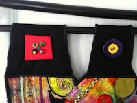
What I had left was then layered over a larger black piece of fabric, hand stitched and quilted to within an inch of it's life, and then I added some beading and buttons on the lower part as well as big, fun buttons on top to create the hanging loops.

Here are a few detail shots:


And here is the finished piece:

Tuesday, November 20, 2012

Gorilla Love


Bonnie's photo art challenge this week is to create an art image using her texture 'Signed & Sealed'.  Yesterday my friend and I were at the Toronto Zoo and I got a great shot of a gorilla's hand.  My image today was simply a matter of adding four layers of Bonnie's texture, 3 using a soft light blend mode (100% opacity for all three) and the forth was added using a pin light blend mode at 73% opacity.  Simple but fun!

Thanks for the great texture Bonnie!

This photo is being linked to This or That Thursdays, and Photo Art Friday.

Sunday, November 18, 2012

Vintage Photography


Mouse over photo to see the 'before' image.

Today I spent a little time playing with a new 'recipe' that Kim Klassen shared in Beyond Layers.  It allowed me to transform this modern snapshot of my friend Carol and her loveable dog, Molly, into a vintage photo.  In addition to using Kim's 'Kristen' texture, I also added a mask overlay to give me the softer edges.

If you want to learn how to do the mouse over technique, read my previous post here.

These photos are being linked to Our World TuesdayTexture TuesdaySweet Shot Tuesday, and Photo Show Off.

Thursday, November 15, 2012

How to Use the 'Mouse Over' Technique...

Credit where credit is due...
this fun 'mouse over' image is thanks to this site 
here.

So many of you have been admiring/enjoying/commenting on my use of the 'mouse over' technique to show the before and after of images of my digitally edited software so I decided I would share the technique in a post.

I used to just link people who asked about it to Kim Klassen's website because that is where I learned the technique.  Kim generously shares (for free) so many wonderful tips and tricks, as well as beautiful textures, and one of them was this mouse over technique.  

Kim also has many amazing workshops and online courses which I can highly recommend.  I have taken Photoshop: the Essentials, and am currently enjoying Beyond Layers.  (Please note that for obvious reasons I would never share a lesson or technique taught in a class that has a fee attached to it!)

Okay, back to the 'mouse over'.  First of all, you need to upload your images (before and after) to a web based site like Flickr or Picasa (those are the ones I use) because you are going to need the image URL (which you can obtain by right clicking on the image once it's in those web based sites).

Next, you need the following code (copy and paste everything between the squiggly lines into a blank document and save it on your computer...Go ahead, do that now...I'll run and get another coffee while I wait...):  Important:  part way down in the code you will see http://lindakittmer.blogspot.com/ which is MY blog URL.  Replace my blog URL with your own, and then save the document.  Do this now so that you only have to do it once and not every time you use the code!  Be careful not to delete the punctuation as computer code is not forgiving.  You must maintain the exact syntax or it won't work.

~~~~~~~~~~~~~~~~~~~~~~~~~~~~~~~~~~~~~~~~~~~~~~~~~~~~~

<div style="margin-bottom: 0px; margin-left: 0px; margin-right: 0px; margin-top: 0px;">
<br /></div>
<div style="margin-bottom: 0px; margin-left: 0px; margin-right: 0px; margin-top: 0px;">
<table align="center" cellpadding="0" cellspacing="0" class="tr-caption-container" style="margin-left: auto; margin-right: auto; text-align: center;"><tbody>
<tr><td style="text-align: center;"><a href="http://lindakittmer.blogspot.com/" style="margin-left: auto; margin-right: auto;"><img onmouseout="this.src='http://farm8.staticflickr.com/7059/6866348739_39f5e72a84_z.jpg'" onmouseover="this.src='http://farm8.staticflickr.com/7066/6866348525_2b0a727255_z.jpg'" src="http://farm8.staticflickr.com/7059/6866348739_39f5e72a84_z.jpg" /></a></td></tr>
<tr><td class="tr-caption" style="text-align: center;">Mouse over photo to see the 'before' image.</td></tr>
</tbody></table>
</div>
<div style="margin-bottom: 0px; margin-left: 0px; margin-right: 0px; margin-top: 0px;">
<br /></div>
<div style="margin-bottom: 0px; margin-left: 0px; margin-right: 0px; margin-top: 0px;">


These next two lines aren't part of the code, but you want to copy and paste them into your document to remember what goes where: 

first and third photo addresses are the “after” images

second photo address is the “before” 

~~~~~~~~~~~~~~~~~~~~~~~~~~~~~~~~~~~~~~~~~~~~~~~~~~~~~~

Okay, now to actually put it into your post...

You'll notice that you can either post by using 'Compose' or 'HTML' (I'm using blogger...sorry I don't know about other blog interfaces).  You'll see the two buttons on the left in the tool bar of the post screen.  Go ahead and start writing your post as you usually would.  When you want to add the photos, click on the 'HTML' button.  You should see what you have typed so far, along with computer code for spacing, etc.  

Open that document you saved with the above code, highlight and copy the code, and then come back to your post.  Put your cursor where you want the image to appear (that should be below what you have written so far) and paste the code.  

Now you have to substitute your images URLs for mine (since that's what you've got in the sample code).  Go to Picasa, Flickr or where ever you uploaded your photos, and right click on the after image.  Copy the code.  Come back to your blog post in progress, and find the first place that you see an image URL (http://farm8.staticflickr.com/7059/6866348739_39f5e72a84_z.jpg).  Carefully highlight it (remember the warning above about computer code syntax) and paste your own image URL in place of mine.  Now, scan down and find the THIRD place you see an image URL and repeat the highlight paste with the same URL.  

Go back to Picasa, Flickr or where ever you uploaded your photos, and right click on the before image.  Copy the code.  Come back to your blog post in progress, and find the second place that you see an image URL.  Highlight and paste to over write my image URL with your own.

Do your happy dance...you're done!!!

It may seem complicated, but once you've done it once or twice you'll find it pretty straight forward.  Perhaps you'll want to print these instructions out so that you can follow along, step by step, for the first few times until you feel confident.  

I look forward to seeing your 'mouse over' before and afters in your future posts!  Please leave me a comment with your link so I can come and check them out.  Thanks!

Monday, November 12, 2012

Day Dreaming at My Desk


Mouse over photo to see the 'before' image.
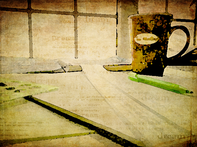
Now that I've got my new desk in my studio, I sometimes find myself day dreaming as I look out the window.  Since this weeks photo themes from Kim at Texture Tuesday and Bonnie at Photo Art Friday compliment one another so well to all this day dreaming, I challenged myself to take a very ordinary iPhone shot of my desk today and edit it in Photoshop to try to create an dreamy, artful still life.

I started with a levels adjustment and then played with the brightness and contrast to get back my Tim Horton's mug which is very dark in the original image.  I added Kim's kk_kristen texture, first at multiply 100% and then again using a soft light blend mode at 27%.

I put on a warming photo filter, flattened the image and then added a watercolour filter to that.  Next I added a couple of painterly textures (a Jerry Jone's painterly texture, and one of Bonnie's painterly textures, both with a soft light blend mode at 100% opacity).  The final edit was to add Kim's kk_dream texture. It just seemed perfect for the 'Dreamy' theme with it's soft subtle 'dreamy' text.

These photos are being linked to Our World TuesdayTexture TuesdaySweet Shot TuesdayPhoto Show Off This or That ThursdaysPhoto Art Friday, and Fabulous Friday.

Friday, November 9, 2012

Playing With Circles

Today I started working on a background for the first page of a calendar journal that I've decided to make for 2013.  My goal is to work on the start of the backgrounds in the next couple of months, so that when the new year arrives I'll be ready to add the writing into each days designated spots.  As you can see, I've started with circles for January.  I have no real plan yet, other than to do it, so we'll see where it takes me...

Thursday, November 8, 2012

Working Upside Down...

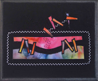
The entire time I was working on this piece, I had it in this orientation, from the initial layout, through the machine stitching and while I was working on adding the hand stitching.  Even when I mounted it on the canvas...


And then this morning, when I tried to hang it up on the wall, it told me I had it wrong.  Don't you love how clever it is to know which way it's to be hung!


Tuesday, November 6, 2012

What a Day!

If you saw my previous post, you know I have computer gremlins and some strange things have been going on.  All of the images on my blog disappeared, to be replaced by a black circle with a minus sigh!  I've been working to restore some and try to figure out what's happening, but it's time for a little 'zen photo time'.

Sometimes the stars are aligned since this week is an 'anything goes' week over at Texture Tuesday and I'm certainly not up for the challenge of a theme right now.

I took this shot in July, while kayaking at our cottage.  I just loved the beautiful red of that new leaf sprouting out of the driftwood.  Hard to imagine that Mother Nature chose to start a new tree right there...


And now I'm off to follow Casey's lead and just go and relax!  The fight with the gremlins will have to continue tomorrow...


Monday, November 5, 2012

Cyber Glitch!

I seem to have some computer gremlins reeking havoc on my blog.  I am working to correct the problem, but until then, things are looking strange.  I hope to have it back to normal soon.

Thanks for your patience!