Thursday, February 28, 2013

Vintage...

Bonnie's challenge this week for Photo Art Friday was the word 'vintage'.  Well, after the fabulous gift I recently received there is no shortage of wonderful images to play with for this challenge!

Mouse over photo to see the 'before' image.
I chose this photo of my Dad.  It's funny to see a cigarette in his hand. He quit smoking when I was a baby so I have no memory of him as a smoker.

As you can see when you mouse over to see the original image, I cropped it to bring my father closer.  While still in Lightroom, I created a sepia version of the image.  I then took both the original cropped image and the sepia version into Photoshop Elements when I layer the sepia one over the other.  I kept it at 'normal' blend mode, but reduced the opacity to about 65% to allow some of the original colour to come back.

I know any snapshots from back then would have had a white frame around them, something that of course is missing from the digitized slides, so I brought in a vintage frame that I have in my files (sorry, I can't remember where it's from, but you'll be able to find lots such things by Googling it). I placed the photo into the frame and called it done!

Update:  I Googled 'free vintage frames for photoshop' and found this frame with the old vintage corners and the scalloped edge at this site.  There are so many wonderful 'freebies' out there! How cool is that!


Wednesday, February 27, 2013

Looking Down...

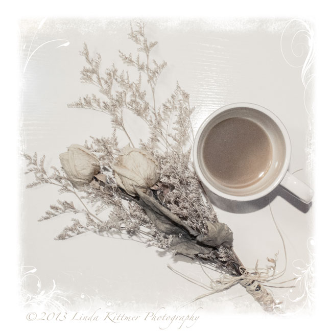
Today's challenge in Beyond Beyond was to do a photo shoot from above so I set up this little still life and climbed on my chair!


In Lightroom I did some minor tinkering with highlights and shadows before using Kim's "Barely Colour" preset.  I then took it into Elements where I added three layers of Kim's "Anna" texture from her Downton collection. The first layer is at soft light 15%, then colour burn 14% and finally multiply at 11% with a gradient mask.  I also added a Jerry Jones texture to get the soft framing which I thought was pretty with this particular image.

A screen shot of my processing is here for your reference.


Bead Journal Project: February and a Red Herring

Here's the next instalment in my BJP 2013. I was a bit worried about how the puzzle pieces would come together since it's tricky to bead a perfectly straight edge when using little round beads, but as you can see in the second photo, showing the first two months together, the joint is not too bad.  Working on the little interlocking 'tabs' of the puzzle pieces is a bit tricky, and of course I have to be careful to make sure I'm using the right colours so that the little buildings match correctly from one piece to the next.  The bright sky is a nice juxtaposition to the gloomy February we've been having...I can't wait for Spring to get here!
Okay, it might not be a herring but it's a little red fish!  On Sunday evening, while watching the Academy Awards, I added the beads to this fish that I had sewn up earlier in the day.  He's about 3 1/2" long and he's going to be used as an embellishment on a piece I'm planning to enter into a juried show.

Tuesday, February 26, 2013

Dreamy Image

I explored Kim Klassen's tutorial on creating a 'dreamy' look to your image, and here's my result:

I used an image of my journal and Twinkling H20 watercolours, which I had been working on earlier.  I had used my 50mm 1.8 lens so that I could get that sweet depth of field.

I added a gradient using a soft pink to pick up some of the colour in the journal and the one paint pot.  In Lightroom, I edited Kim's texture, Edith, changing it from a gold colour to a pink tone and then added it with a soft light blend mode at a low opacity (around 35% or so).  The text was added using the font Sweetly Broken, and I picked a very soft pink shade from the image for my text colour. I also had to add a bit of a drop shadow to get the text to stand out enough to be legible without having to go to a darker font colour.

Linking up with Our World Tuesday, Texture Tuesday, Sweet Shot Tuesday

Monday, February 25, 2013

A Triptych of Canvases

I've been working up the nerve to do some painting on canvas, but this is not something that is in my comfort zone.  In the last few weeks I've been watching Karen Ellis of The Art House Studio during her live Ustream broadcasts on Friday evenings, and I've learned a lot about how to get the wonderful layered look that she does so well for so many of her backgrounds.  Combine that with lesson 17 of Joanne Sharpe's Letter Love 201, in which we were to get out a little 6 inch canvas and some acrylic paint to create a 'Character Mastepiece" and I thought what the heck.  If I was going to jump in, why not jump in with both feet.  If one is good, three must be better...

I figured I had little to lose since I got the three little canvases at Dollarama, and with it being acrylic paint, if it was a total disaster I could always paint over it...

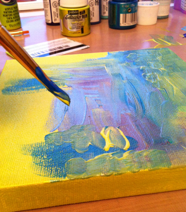
I started by painting all three of the canvases with a base coat of a bright lime green.  I then used a combination of my brush, and an old gift card and started adding some blues and a bit of purple along with more of the lime green.  A couple of the blues and the green are metallic paints, so they have a bit of a shimmer to them.

Using a stencil and a baby wipe, I added a bit of white.  The final step in creating the backgrounds was to use a bit of corrugated cardboard to stamp on each of the canvases.

Below you can see the three canvases side by side, as well as my messy work area.  Now that I've got a good craft mat, I tend to put the paint right on the mat.  It wipes up beautifully with baby wipes and I find it's easier than using a palette, especially when I want to stamp with corrugated cardboard or my ammo case insert (a great find at Waste Wise)


I must say, so far I was thrilled.  I actually achieved the layered look that I so admire in Karen's work!  The next step was to add a letter to each of the canvases.  I decided that since I had three canvases I'd use a three letter word.  I was going to do ART, but then I thought why not use the word I have chosen as my inspirational guiding word for 2013 and so, I painted JOY on my little canvases.

I found this fun font online when I did a Google search for fonts (looking at the images tab) so I sketched out the letters, transferred them onto my canvases and started painting.  I used a gold metallic paint, along with a bright yellow for the highlights and black for shading (as you can see, this time I did use a palette since I was painting with a brush and my finger).  I must say, I'm very happy with how these little pieces turned out.

And here you can see it hanging in my studio.  I'm not sure I like that arrangement, but I'll leave it like that for now.

Sunday, February 24, 2013

Doodling with a Paint Brush

I could definitely get used to doodling with a paintbrush. This is another spread that I started at the Decorative Doodling class.  As you can see at the top half of the page, I really got into a bit of a tiny spiral trance.  I was loving how the 'Twinks' layered so beautifully and the different tones of that fabulous green (Twinkling H2Os Olive Vine) that I was getting depending on the amount of paint on my brush.

When the paint was dry I added some outlining and doodles with a black Pitt pen and then added a 'sketchy text' quote by Frank Zappa.  "A mind is like a parachute.  It doesn't work unless it is open." True story! LOL

Saturday, February 23, 2013

Pearl Pen Doodling

Here are the two Pearl Pen doodles I started at Saturday's Decorative Doodling class.  This was a lot of fun, but it will take some practise to write with the Pearl paint pens.  You've got to keep moving at a steady pace, without touching the page or you get globs and ridges in the paint.   I added the doodles using a Pitt pen before painting with 'Twinks'.  I do love the shimmer in those watercolours with the mica!

Friday, February 22, 2013

Playing with Gelatos

Another piece from the Decorative Doodling class, this background was doodled using Gelatos.  A water brush was then used to activate the colour and allow it to spread.  For some reason the green didn't cooperate, but the rest of the colours were like painting with butta' to quote Karen Ellis (Art House Studio) and Joanne Sharpe.  I've added some doodles with a Pitt pen, but I have to say I'm not sold on the Gelatos yet...although the metalic ones were pretty cool!

Thursday, February 21, 2013

Finishing Up Some Decorative Doodles

On Sunday I posted about the Decorative Doodling class I took with Joanne Sharpe and I showed you the doodles I had started.  You'll never guess what I've been working on this week. LOL

Here are the first two I have finished. I really love the upper right part of the top page.  I think the left side of that one got a bit too busy and 'heavy' compared to the right side.

Looking at the bottom image, I've decided that if I plan to add colour I need to keep the petals on the flowers simpler.  It looking fine as a black and white doodle, but when I started painting them it just got crazy.  Maybe it's also my colour choice. I do like the little coloured 'pebbles' (bottom rt corner and left side), and I like the contrast of the black and white stripes and checks with all the colour on the page.

Wednesday, February 20, 2013

Art Tags...a Little Something from Nothing


When I'm working with either watercolour or acrylic paint these days, I like to keep a couple of blank tags on my desk.  Instead of wasting the paint that's on my brush when I want to change colours, I doodle with the brush on one or both of the tags to use up as much of the paint as I can.  I end up with some interesting backgrounds and then later, I can add some doodles and lettering with a black pen to finish the tag.

This first tag was made using Twinkling H2Os or Twinks as they're often called.  I was working on some of the pieces I started on Saturday night.

I've also been playing around with writing with my glue gun (a lesson in the Letter Love 201 class).  I had a package of sparkly glue sticks in gold, silver, red, blue and green, so I thought I'd see what the gold and silver looked like using this technique.  I must say, I think I prefer the control I get from the dimensional Pearl Pens, and they seem to result in a very similar look, but the one neat thing the glue gun lets you do is create a dimensional word on your not stick mat and then pick it up and use it as an embellishment on another piece.  The Pearl Pens may work for this too, but I'll have to experiment to be sure.  The glue gun glue certainly dries quickly which is a real bonus!

While painting some of these with Silks acrylic glaze, I was again cleaning my paintbrush on a couple of blank tags.  You can see the painted tags on the right of this shot.

After doing some sewing, I went back and added some doodles to the tags using Pitt pens in black and silver, and a white Signo pen.  So far, I think I'm liking these tags more than the glue gun words, but I'll have to reserve judgement until I figure out how I'm going to use them in an art journal page.

And finally, here's a page I created using one of the glue gun words.  I did the word on a navy blue card stock and then lay it over the white journal page before spraying it with a copper Perfect Pearls mist.  I then moved the dark card stock out of the way and sprayed some bright yellow Dylusions ink onto the page.  I off set the card stock so that it would give me a bit of a bright highlight along the lower edge and to the right.  I added a quote in that space.  Finally I used a star shaped hole punch to cut the stars in the card stock and then I glued them randomly around on the yellow paper.  I found that the gold glue gun glue didn't show up as well as I hoped so I added a bit of a highlight using the white Signo pen. It actually stands out quite well but I couldn't seem to get a good shot that does it justice.