
Thursday, May 31, 2012
Intentions
Wednesday, May 30, 2012
Bead Journal Project: May
 I finished my May BJP piece and I've got a full day to spare! The colour inspiration again comes from Vicki Welsh's Colour Palette Challenge.
May has been about gardening and enjoying the beautiful spring weather we've been so fortunate to have. I started off with the three larger flowers with their long stamen.I then went on to do a collection of fun little flowers that stood up on bugle bead stems. Pulling in the various colours of the palette, I just continued to fill in areas as I was inspired and slowly the piece came together.
Here is the finished piece for May:

And here is the growing spiral, January through May:

Change
Yes, today's word in Beyond Layers is 'change'. I had two great quotes and I couldn't decide between them so I used them both. For a change, I've given you both images to compare at the same time instead of using the 'mouse over'.

Tuesday, May 29, 2012
Peace
 |
| Mouse over photo to see the 'before' image. |
Kim's word for today, in Beyond Layers, is peace. You can see from the 'before' shot that I cleaned up the branches that were in the top right corner and then altered the tree line at the bottom. I used a painterly texture from Jerry Jones at Shadowhouse Creations.
Monday, May 28, 2012
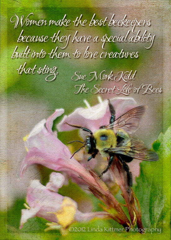
Beekeepers
 |
| Mouse over photo to see the 'before' image. |

I have added Kim's 'Sunday' texture as well as Bonnie's 'Antique Farewell' texture. I've also added this minimally processed version, to the right, because I really love the original shot, too. I just did a bit of cropping and added the subtle frame.
Saturday, May 26, 2012
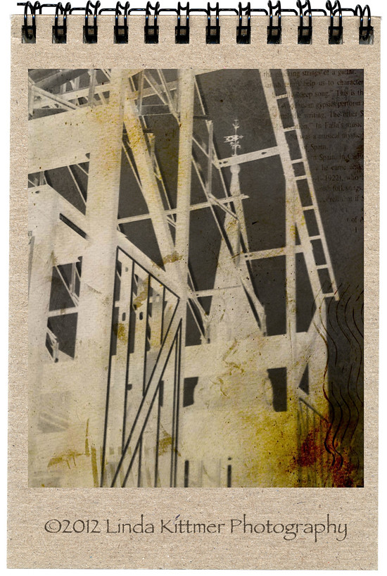
Breaking News

I'm sorry to say that computer gremlins have reeked havoc on some of the images on my blog and I have not been able to correct the problem. In this case, the process shots are missing, but I was able to restore the image of the finished piece, and some close ups of the stitching which are at the end of the post.
No, I don't have anything particularly exciting to report other than I've finished a piece I've been working on rather extensively over the last few weeks. 'Breaking News' is the title of my newest mixed media piece. It started with a cup of tea...
Last summer Doeteke, a friend of mine, was saving tea bags to use in her art and as I was drinking a cup of tea a couple of months ago I remembered this fact and started to save my own tea bags. Then, in April, Heather presented our GOE group with a challenge that involved using newspaper and the wheels started turning.
 |
| Sorry this image has gone missing and I can't restore it...computer gremlins reeking havoc! |
 |
| Sorry this image has gone missing and I can't restore it...computer gremlins reeking havoc! |
 |
| Sorry this image has gone missing and I can't restore it...computer gremlins reeking havoc! |
I pulled out more paint, this time adding various metallics in coppers and golds as well as the original colours I had started with. I also collaged some of the tea bags on at this point to try to get more of a subtle effect with the wine labels. The tea bags are great for this because they have some opacity to them. I was beginning to see hope at this point. Ironically however, the more paint I added the less of the underlying collage I could see.
I have also been experimenting with rust dying lately and thought that some of the rust dyed fabric would work well on this piece.
 |
| Sorry this image has gone missing and I can't restore it...computer gremlins reeking havoc! |
I cut several random circular pieces (freehand so they wouldn't be perfect), and I started laying them on top of the painted piece, auditioning their placement. I settled on a gentle curved path that rose up from centre left and then curved down toward the bottom right corner. The piece was looking too monochromatic at this point so I added some bits of a sheer black fabric to break it up a little.
I then grabbed a paint brush and some white paint to give it some pops of accent colour. I started by painted the three circles near the centre left and then I created another random pathway, using straight lines and adding a few square shapes. I also did some stamping using an old potato masher. As I was adding the white I was sort of wishing I hadn't because it was just too glaringly bright.
Seeing as the paint had for the most part obscured the newspaper and wine labels, I wanted to bring in some more newsprint (Remember the GOE challenge!) so I started tearing narrow strips and collaged them overtop of my white painted lines. It was perfect to knock back the starkness while still keeping some accent. A few more teabags were collaged over the potato masher stamps to knock them back a bit too. By the way, at this point, the vineyard article was long gone and I was using newspaper from the front page of the paper. That's when the name of the piece came to me. Breaking news. I was literally breaking (or tearing) news stories, and I was seeing words about killings, blood, etc. That and the random areas of red paint, the footprints (or are they finger prints?) created by the potato masher stampings, and I began noticing 'evidence' appearing as if at a crime scene.
The next step was to layer it with batting and a backing and take it to the sewing machine for literally hours of intensive thread sketching/quilting. I used a coppery red colour thread to highlight some of what I now saw as blood stains, as well as doing the pebbling effect on the rust dyed circles for some added texture. A gold thread was used to bring out some of the areas that had been painted with the metallic paints, and the rest was stitched with a subtle taupe colour to create texture while at the same time pushing those areas back a bit.
Here are a few close up photos showing the stitching. Click on them to enlarge, if desired.


And finally, here again is the finished piece, trimmed and ready for hanging. I photographed it on a black background so that you can more easily see the shape of the finished piece.
Thursday, May 24, 2012
ATCs From Trimmings
 I working on a piece of mixed media art right now (almost done) that involves paint, fibre and paper collage and a lot of stitching. Yesterday I was trimming it up and I just couldn't bring myself to throw away some of the more interesting bits that were left over. Instead, I pieced them together and made a couple of ATCs. Waste not, want not!
Life at the Cottage

Couldn't stop at just one... this is a photo of my son, taken about 10 years ago.

Wednesday, May 23, 2012
Combining My Photography and Lettering

Yesterday, while playing around with my pens I decided to print a copy and do some lettering right on the photograph so that I could use my own hand lettering to add a message instead of adding text in Photoshop. I was pleasantly surprised by how well the pens work on the photo paper.
The black was done with a Copic Multiliner. I used a Sakura Gelly Roll for the highlights, and finally put in some shading with a grey Copic Ciao.
Tuesday, May 22, 2012
Step One: Prepare Substrate
Well, as I said in yesterday's post, you'd probably be seeing this image again. I was so inspired by the colours in this altered photo image that I couldn't wait to get in onto some fabric so that I could begin some hand stitching and beading on it.
I found some pale yellow woven fabric at a thrift store a couple of months ago. It's fairly stiff and it has a good salvage edge, so I cut it to 8 1/2" x 11", crossed my fingers, and fed it into my printer.


I've used Misty Fuse to adhere it to a piece of wool felt and did a bit of machine zig zag on the edges to keep it from unravelling while I do the hand work.
I'll post the finished piece once I have it stitched, beaded, embellished...
Monday, May 21, 2012
One Photo - Three Ways

I've spent some time this evening playing with a photo I took a few days ago with my iPhone. I have a fabulous new Nikon that I got for Christmas, but my iPhone is always with me and so it seems some of those unexpected shots are captured when I have no intention of taking any pictures. Thank goodness the iPhone has a decent camera!
The one problem I find with the iPhone camera is that often when the flash goes off the photo ends up being very foggy looking. However, this particular shot resulted in a crisp, bright centre and the dark edges that I quite liked. I added Kim Klassen's new texture 'epiphany' and a bit of a subtle border, but it really didn't need much processing.

On this next image, I decided to play with some filters and then I made multiple copies, each time 'grabbing' the corners and transposing them to create this abstract version.

This final image is my favourite. I was playing with several of Nancy Donaldson's textures, layering them and playing with the blend modes and opacity. I also experimented with adding a hue/saturation layer in which I changed the colours from the original. Finally, I added one of Jerry Jone's textures which included some text. I love the text that subtly shows through as well as the vibrant colours. I think this would make an amazing substrate for journalling or perhaps some hand stitching and beading in a fibre art piece. I suspect you will be seeing this piece again, in one form or another.
Friday, May 18, 2012
Growth Over Time

Today I decided to post a traditional quilt that I am especially proud of, called Growth Over Time, as part of the Blogger's Quilt Festival. This quilt is an original design. The centre "9 patch" of diamonds in the quilt was hand pieced and then I designed each of the borders around it, one at a time, to best suit the quilt as it grew. The first border around that 9 patch of diamonds echoed the diamond shape to create the larger diamond that makes the focal point in the centre.
I had a lot of fun putting it up on the design wall at each stage of it's growth, to study it and decide what should come next. As you can see in the photo to the right, there are sections of prairie points in each of the corners which taper off from larger to smaller as they move away from the corners. The little 5 point diamond 'flowers' are hand appliqued.

The finished quilt is 89" X 98" and drapes beautifully over our queen sized bed.
Lilac

I'm having fun exploring patterns in Photoshop Elements after Kim's post in Beyond Layers today.
I just planted a lilac bush like this in my garden last week. Mine's not in bloom, but this photo was taken of a similar, more mature bush. I love the white edges on the blossoms. I can't wait until mine starts blooming as it matures!
This photo is being shared on This or That Thursdays, Photo Art Friday, Shoot, Edit, Submit and Photo Friday Link Party.
Tuesday, May 15, 2012
Preserving History While Moving Forward
 |
| Mouse over photo to see the 'before' image. |
This photo is being shared on Texture Tuesday, Sweet Shot Tuesday, This or That Thursdays, Photo Art Friday, Shoot, Edit, Submit and Photo Friday Link Party.
Sunday, May 13, 2012
Mother's Love

 I started by using ink spray and a stencil to create a background and then I wrote the message over top using Pitt pens and added a bit of accent colour with my Copic markers.
  I especially like the way the heart came out, especially considering the message says, "Mom, the ribbons of your love are woven around my heart."
Saturday, May 12, 2012
Photo Cards
I've been looking at some of my photography, as well as many of the wonderful comments that you've been making about them and I decided that I would use some of them to make greeting cards.
I have been making my own greeting cards for a while now, but this is the first time I've used them for greeting cards.
Ironically, these two pictures were taken with pretty poor lighting on my iPhone, so they don't do the cards justice. I've written where the photos were taken on the backs of the cards so that the recipients will know a little more about the images.
 If you're interested in seeing some of the other greeting cards I've made, using collage, paint, stitch, etc., you may see them by clicking on these links:
collaged cards,
lettered & collaged card,
machine stitched surface designed fabric,
acrylic paint,
hand stitched cards,
and handmade paper & machine stitch
Tuesday, May 8, 2012
Spring Blossoms Up Close

Sometimes it's true, a picture is worth a thousand words, and so today I will let you decide how this photo speaks to you.
This photo is being shared on Texture Tuesday, Sweet Shot Tuesday, This or That Thursdays, Photo Art Friday, Shoot, Edit, Submit and Photo Friday Link Party.
Sunday, May 6, 2012
Kindness Chronicles
This month, I created a photo art piece that demonstrated the bravery of firefighters (see it here). It wasn't my intention at the time to do something kind, but when I read the many comments and discovered how the piece had impacted some of my readers, I realized that it had touched people and they were thankful for my acknowledgement of what these brave men and women do for us. I decided to send the photo to our local fire chief, as well as the fire chief in Magnetawan, where the original picture was taken, and asked them to share it with their staff as a way of thanking them for all that they do.
It seems I can't talk about kindness without mentioning my wonderful husband. As you may have read in previous posts, Bill is an amazing woodworker and he creates beautifully artistic cutting boards (see them here and here). This month, while at the vet's office with our dog Casey, our vet was asking Bill about what woodworking he had been up to lately. Bill told him about the cutting boards and Evan was most interested. Later that afternoon, Bill returned to the vet's office and offered Evan a deal. He would give him a cutting board with the condition that when someone came in with an animal that needed care but couldn't afford it, Evan would 'pay it forward' by offering his veterinary services for free. Evan loved the idea and is now the happy owner of one of Bill's cutting boards.
Please drop by Lyric Kinard and Jane LaFazio's blogs to read about their Kindness Chronicles.
Thursday, May 3, 2012
Pathways

This was such a fun piece to work on. It started with an interesting piece of handmade paper that was created by wrapping some variagated fuzzy yarn around a frame. The resulting piece of paper was dimensional and had an intriguing lacy texture.
 After auditioning a few fabric choices I settled on some of my purple and blue hand dyed pieces to bring out the colour in the yarn used for the paper making. I used a duel sewing machine needle to quilt some random pathways on the main background piece and then attached the paper using some more machine stitching.
From there I created some beaded lines that I had going in and out of the various holes in the paper. Some additional lines of fabric were included and some accent buttons were added to them.
 I wanted an asymmetrical piece, so I added a few more pieces of the hand dyed fabric to create the piece that hangs down from the right side of the finished piece. They were embellished with some accent buttons, coordinating threads and beads. Finally, I added some hand stitching, using hand dyed variegated threads, to create some more pathways as well as added texture using the seed stitch and a few cross stitches on the smaller squares and rectangles.
Tuesday, May 1, 2012
A Bird in the Hand...
 This beautiful young gold finch knocked itself into a stupor when it crashed into our cottage window last summer. Fearing that it may die of shock (or become an interest to our dog), I picked it up and held it in my hands to keep it warm. After a little while it was strong enough that it wanted to sit up in my hand but it continued to rest with it's eyes closed as you see here. Finally, after about 30 minutes it started to look around and when I put it closer to a tree limb it flew up into the tree.
This post has been linked to Texture Tuesday, Sweet Shot Tuesdays, Photo Art Friday (book connection: A Bird in the Hand, by Ann Cleeves), and Photo Friday Link Party. You might be interested in taking a look at some of the other photography that is being shared on these sites.
Subscribe to:
Posts (Atom)