Sunday, April 29, 2012

The Life of a Dandelion


I've been working in the garden today, adding mulch to all the beds to clean things up and hopefully deter some of the weeds that seem to flourish in our garden.  Before my husband had a chance to pull them all, I took some photos of the dandelions in their various stages of development so that I could play with the tutorial Kim gave us in Beyond Layers this week.  Now all I need to do is to figure out how to slow it down so it's not quite so dizzying to look at.

Update: still trying to learn how to slow down the gif, but I did figure out a trick that seems to help.

Update #2:  I learned another Photoshop trick from Kim so I've added this multi-image shot of the same photos used in the animation.


Sneak Peek

 Sadly some sort of a computer glitch has caused all of the images in this post to disappear, and I am unable to correct the problem.  Sorry!
It seems like such a long time since I showed you any fibre art.  Well, it's not that I haven't been working on any, but rather what I've been working on is taking a long time.  I thought I'd give you a little sneak peek at what the piece is starting to look like.  Here are a couple of close-ups of two different areas on the piece.


A few years ago I bought this little package of buttons at the dollar store and there were a few 'rejects' that had only 1 hole, or in one case 3 holes.  That might be a problem for a seamstress or a tailor, but for me it was a great windfall.  Isn't this one fun with the stitching and little beads in the centre to fill that lonely hole.

Hopefully I'll be able to post the finished piece in the next week or so.  I hope I've piqued your curiosity. :o)

Friday, April 27, 2012

What I Was Up to Today...

Sadly some sort of a computer glitch has caused all of the images in this post to disappear, and I am unable to correct the problem.  Sorry!
Back in February, I posted a tutorial about making your own washi tape.  Well, I was running low so it was time to make some more, but having had some time to think about it, I have made a few changes to the process.
I started by cutting my tissue paper into smaller, more manageable pieces.  I made them about 6 inches long and the width of 4 strips of my double sided tape, plus a tiny bit more for wiggle room.  I then put the four strips of tape, side by side, on the tissue paper.
Last time, I stamped the tissue before taping it (with not protection on my ironing/work surface) and you can see I have a permanent record of that day's efforts! LOL
Today I put the tape on the tissue paper first, which I found made the process faster and easier (and less messy).
I also lined my work area with newspaper, just in case, but with the tape on the back, the ink doesn't come through.


Here they are before and after I cut them apart.  Aren't all those wonderful colours just the best!

The other 'studio' time today was spent doing some tidying and organizing.  A few years ago I found this wonderful old post office unit at a big outdoor antique market.  I thought it was perfect for housing fat quarters, and smaller pieces of my hand-dyed fabric.  There are 90 little cubbies in the unit, so I've found there's room for some little bins of various art supplies too.  The glass doors keep the dust out but still let me see what I have inside.
 Today I got busy reorganizing and labelling those bins.  Here's a close up of some of those wonderful little bins of 'stuff'.
And my nicely filled bin of washi tape!

Tuesday, April 24, 2012

Anniversary Greetings

This is just a quick post today to show you another greeting card I made.  This one combines some of the fun new skills I've been learning in Joanne Sharpe's classes on lettering.  I had a lot of fun creating a beautiful background paper, lettering and then adding my own handmade washi tape to add some accents.   

Monday, April 23, 2012

Bravery Personified


In Kim Klassen's Beyond Layers this week, the focus is on bravery.  Although this can mean so many different things to so many people, the first image that comes to mind for me when I think of bravery is a firefighter.  As the quote I used in this piece suggests, just the fact that someone chooses to become a firefighter is a phenomenal act of bravery.

This photo was taken last summer when I was out cycling and I came upon the tragic fire in the town of Magnetawan.  Sadly, the general store and 'June's Restaurant' as it was known to locals, was lost to the fire.
Note:  It was a really hot summer day. Add to that the heat from the fire and it must have been sweltering in that uniform!


This post has been linked to Texture Tuesday, Sweet Shot Tuesdays, Photo Art Friday, and Photo Friday Link Party.  You might be interested in taking a look at some of the other photography that is being shared on these sites.

Saturday, April 21, 2012

Bead Journal Project: April

Well, here it is just past the middle of April, and my Bead Journal Project piece is done!  As you may remember, I am taking my colour inspiration each month from Vicki's Colour Palette Challenge, and this month the colours came from mouldy pie.  Yes, you read that correctly.  As disgusting as it sounds, the colours are actually wonderful.
I started with some fun bugle beads that were the perfect colour combination as well as a piece of whale bone that my friend Heather bought for me a couple of years ago while she was visiting my cottage.  The spokes represent my bike since I try to cycle about 30-50 km (19-31 miles) each day, and the whale bone represents the centre hub of the wheel with the chain circling the gear. 

I then made a bunch of meandering paths to represent the various routes I cycle, to give it sort of a map view. 
Once the paths were complete I just filled in all of the background area with the neutral coloured beads.


And, here's this month's finished piece.


 Four months done and eight to go...

I love how the spiral is coming together.  I'm starting to think about how I will mount this for hanging since the beads are pretty heavy and once the twelve months are complete the total weight will be significant.  Oh well, I've still got eight months to worry about that. LOL

Wednesday, April 18, 2012

Monday, April 16, 2012

Spring Beauty

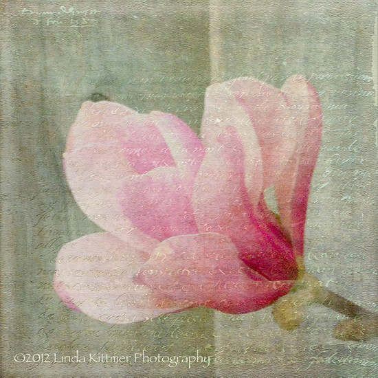
I love the beautiful magnolia trees that are all in bloom these days, marking the signs of new life as we enjoy warm Spring days.  I took this photo with my iPhone while I was out for a walk with my dog, Casey.

I have used a couple of beautiful textures in my processing of this photo.  One is a wonderful watercolour texture, called "I Am", which was created by Kim Klassen.  The other is a fabulous texture that includes text.  It's called "Antique Farwell" and it's by Bonnie Zieman of Pixel Dust Photo Art.   My goal in my processing this week was to soften the image while adding a bit of colour to the grey of the wooden fence.  I love the added interest that the writing provides the image.

Mouse over photo to see the 'before' image.

Saturday, April 14, 2012

A Little Rain Must Fall


Today while waiting for bread to rise I had some fun creating another journal page.  I used a background spread I had done a while ago and added a wonderful quote by Longfellow.  Considering the grey clouds outside, it just seemed like a good choice.  I started by adding an umbrella cut out of a page of text and then I added the quote.  


Because I often end up leaving out words as I write, I thought it would be safer to write the quote in pencil first and then go over it with my Pitt pen.   


And finally, the finished piece, complete with a few clouds and raindrops.  It's hard to see in the photo, but the raindrops are made with metallic pens which give them a bit of shimmer.  If only all rainy days could be this bright and colourful!

Friday, April 13, 2012

GOEs Recent Activities

I'd like to invite you to drop by the Group of Eight Fibre Artists' blog to see what we've been up to.  We recently shared our Steampunk Challenge pieces and I posted photos on our group blog.  You might also be interested in seeing the ATCs we made for our April swap.

Thursday, April 12, 2012

Collaged Greeting Cards

This is just a short post today to share some new greeting cards I made using acrylic paint, some bits of old leftover pages of text from a previously altered book, tissue paper and a black sharpie marker.  I start by using a 9" x 12" sheet of watercolour paper which results in 6 cards since the window on my trifold card blanks are 3" square.

Wednesday, April 11, 2012

Spring Blossoms Finally Finished


Several weeks ago, while making background papers for some journaling, I posted about the beginnings of these little art quilts. 

I cut very simple shapes to represent the flowers and leaves and used a background of neutral scraps.


Black thread sketching at the machine further defined the flowers, leaves and stems.  This is the stage at which these pieces sat for many weeks as I worked on other projects.  I obviously took these pictures under very different lighting conditions.  The newest photos, showing the finished pieces (below) show the accurate colours.  

I finally got around to quilting the neutral areas and I decided I would mount the pieces onto another simple quilted background.  I started auditioning some backgrounds for these pieces using some of my hand-dyed fabrics and I settled on four different colours. 
Although the photos don't show it well, there are two fairly different blues, as well as the green and the purple. 

Tuesday, April 10, 2012

Texture Tuesday: Little Things

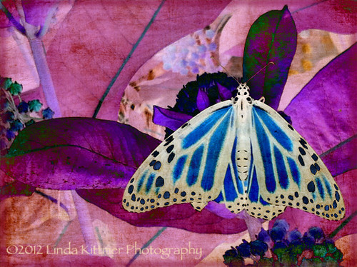
Today's Texture Tuesday challenge was simply to use Kim's 'little things' texture.  As I considered a subject matter for the photo, I remembered this photo of a monarch butterfly that I took last summer.  Seeing as it is a 'little thing' itself, I thought it would be perfect.  I opened Photoshop Elements and I started to play.  I tend to fall back on the same few blend modes when I apply textures (usually soft light, screen or multiply at varying opacities depending on the image I'm striving to achieve), but this time I was just exploring some of the other options when I came across 'difference'.  I thought it created a wonderfully intriguing change to the image.  So much so, in fact, that it has inspired me to create a piece of fibre art with this image.  I love the colours that resulted in the altered image.  I'm not sure the direction this piece will take, but I will certainly share it as it progresses.  For now, go ahead and mouse over the image to see the original photo.

Mouse over photo to see the 'before' image.
I will also be linking this to Bonnie's Photo Art Friday.  If you love photo art, you might be interested in checking out her blog.

Monday, April 9, 2012

Winner of the Blog Hop Prize...

Thank you to everyone who participated in the blog hop and left messages telling me about your creative outlets.  I always enjoy reading about what others are doing artistically.  
The lucky winner of the 'blog hop candy' is Paula.  


Paula, please send me an email (lkittmer@cogeco.ca) with your mailing details and I'll get the prize out to you ASAP.  Congratulations!

Friday, April 6, 2012

Faux Encaustic Looking ATC and Give-away

Sadly some sort of a computer glitch has caused all of the images in this post to disappear, and I am unable to correct the problem.  Sorry!


I'm participating in an Easter Blog Hop so I thought I'd do a little tutorial on creating an ATC that has sort of a faux encaustic look. This began as an experiment, but I'm please with the results. 
I started with the image of the angel and egg on the sheet music.  I found this lovely image on Pamela's wonderful Vintage Digi-stamp blog.  I opened it up in Photoshop Elements and selected and used some of the colours to create a second coordinating image by using a photo of a collection of gears, over which I put a texture layer at a light opacity to get that coordinating aqua colour while still letting the gears subtly show through.  Wait, don't panic!  If you aren't comfortable using Photoshop or other photo editing software you can easily make an ATC like this with any scrapbooking paper or printed image you may wish to use. The background piece needs to be 2 1/2" X 3 1/2" (standard ATC dimensions) and the accent piece is a little smaller to allow some of the background to 'frame' it.

The next step is to melt some wax (I used soy wax because I had it) in an old electric skillet.  I found this little electric skillet at a thrift store for $3.50.  Once the wax was melted (I set the skillet at 300 degrees F) dip the paper in the wax just to wet it.  I then just held it up to let the excess wax drip off and let the wax dry for a about a minute before I set it down on a piece of parchment paper.  I'd like to try using bees wax next time because I suspect it may give a nicer, warmer look because of the subtle colour of the wax.


At this stage I decided to use an old credit card to scrap off some of the wax (front and back) because I wasn't happy with how thick and uneven the wax surface was.  I kept the scrapings to reuse them for another time.


My next step was to use some distress ink to knock back the starkness of the page.  In hind site, this step would probably be better done before waxing the paper so that the ink is sealing under the wax.  Because the ink wiped readily from the wax, I used a bit of quilt batting to blot the ink to create a bit of texture and then to keep it from rubbing off later I sprayed on a layer of SpectraFix.  This product is sold as as a fixative for pastel, charcoal, pencil, and mixed media.  After a bit of drying time the distress ink was 'fixed' on the surface and no longer rubbed off.
Fortunately this fixative is all natural and oder free so you can safely use it indoors.


Once the fixative was dry I cut the pieces out and then it was on to the sewing machine.  If you prefer, you could use glue at this stage, but I like adding a bit of stitch.  I used a zig-zag stitch to secure the background to a 2 1/2" X 3 1/2" piece of Fast2Fuse.  I like the structure that it gives the finished ATC while still having some flexibility.  I also add a piece of printed card-stock that has my name, etc. on the back of the ATC.

I then used a straight stitch to layer the angel piece over top of the background.

Here you can see what the ATCs look like once the sewing is finished.


The final step was to use some copper coloured acrylic paint to 'guild' the edges.


I always make a small series of ATCs.  In this case, one is for a swap with my GOE fibre arts friends, I always keep one for myself, and this time round, one is for YOU!  That's right, one will be part of the give-away for the blog hop (more about that in a moment).


And here's a closer image of one of the ATCs.


And now for the details of the giveaway...


One lucky reader will win one of these ATCs plus the other bits of 'blog hop candy' as pictured (Cloth, Paper, Scissors DVD which includes all 6 back issues of the magazine from 2008-great for ideas and inspiration; soy wax-so you can try this tutorial; various papers including some wonderful old dictionary pages-again so that you can try this tutorial).  For a chance to win, please leave me a comment telling me what you like to do to express your creative/artistic side.  I will be randomly drawing a winner on Monday, April 9th.  Please be sure I have a way of contacting you if you win.  Good luck!


Don't forget to check out the other blogs on the blog hop.

Happy Easter ~ Happy Spring!

Tuesday, April 3, 2012

Texture Tuesday: Soft

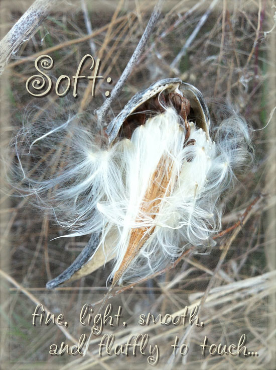
Today's Texture Tuesday theme is soft and as you would have it, while walking my dog yesterday I came across these wonderful milkweed seed pods that had opened to release the silky, soft seeds within.  I decided to try to soften the overall image using one of Kim's wonderful textures at a fairly low opacity of the soft light blending mode.  I had to remove the texture from the actual seeds because they became too washed out, but I think I have achieved the softness I was going for.  I also used the tricks that Kim taught last week to soften the edges of the image, framing it with the same softness.

Mouse over photo to see the 'before' image.

Monday, April 2, 2012

European Quilt Art Magazine


I got an email from Gabi Maier today to let me know that the second issue of the new European Quilt Art online magazine is available for reading online or downloading.  The best part is that once you register you'll have free access to this issue of the magazine as well as the first issue.

Check it out at European Quilt Art magazine.  I haven't had a chance to read this issue yet, but I certainly enjoyed the first issue!


Check it out at European Quilt Art magazine.  I haven't had a chance to read this issue yet, but I certainly enjoyed the first issue!

Bead Journal Project: March

Well, this month (or rather last month since it's the piece for March) I actually finished beading on time, but I'm still a little late posting.

I started with 5 'snowflakes', my interpretation of the Whistler/Blackcomb symbol and the three copper beads to represent three nights spent at the resort.  I then filled in the background of that area with the random beading in the yellow, gold and orange beads.  I wanted the snowflakes and resort icon to be subtle.

Since I don't plan these bead pieces, the rest just evolved section by section as I played with adding various rows, spirals, etc.


Finally, here are the first three month's pieces shown together.  You can begin to see the spiral developing.