Showing posts with label pan pastels. Show all posts

Wednesday, February 26, 2014

Doodling and Exploring a New Technique...

A little while ago I watched a YouTube video done by my friend Carolyn Dube, in which she used pan pastels and stencils to create a journal page. It looked like a lot of fun, and I needed a quick 'art play' so I gave it a try. I used my Stencilgirl peacock feather stencil, designed by Kae Pea along with colours that you'd expect to see in real peacock feathers.  I just love those colours!
I wanted a really soft, almost slightly blurred background so I used a very soft brush to gently brush over the page, pulling out from the core of the feathers. I probably should have stopped here since I love this...but I didn't...

I then grabbed the stencil and a permanent black pen and I traced the stencil a few times, filling it in with little cross hatch marks.


At this point I added my text and then put another feather up at the top, this time using only part of the feather.  Random swirls and dots filled in some of the border areas before I did a bit of journalling in the space under the two feature feathers.

I'm not sure why I had such a hard time getting good photos of this page, but the black is really dark (unlike the deep grey that you're seeing in these images).

The end result isn't as wonderful as the vision in my head was, and I sort of wish I hadn't covered up that beautiful background.  Oh well, I know how to recreate it!


Friday, February 8, 2013

Polka Dot Letters and Words...

Here are a few of the fun pages I've been doing while taking Joanne Sharpe's latest online class, Letter Love 201.  It's a great way to get into an art trance and just doodle!

The word collage was done on an old dictionary page.  The coloured border/background is done with pan pastels.

The lettered page below, on the left, was just not popping for me, so I added some polka dots to all of the letters in my first and last name (I had to add an extra 't' because initially there was only one) and then I gave it a bit more of a colour pop too.

If you need something to pass the time, figure out where the extra letter was squeezed in on the second image.  It shouldn't be too hard since you already know it's a polka dotted 't'.


And finally this last piece for today...I think I'm getting a bit carried away with all the polka dots and the 'bee' is just way to cutesy for my usual style, but oh well...

As I look at the bee here, I don't think those little wings are going to support a bee that size. :o)

The jumbled letter piece was definitely my favourite of these three activities.  I can see some potential for variations on that idea.  I love the dimensionality of the layers of letters.


Saturday, February 11, 2012

Alphabets, Word Grids and February's Sketchbook Challenge

I've found myself falling way behind in Letter Love 101.  Joanne is sharing so much amazing 'stuff' that I find myself playing and not moving on to the next lesson. LOL  Yesterday I started this word grid.  I decided to add a few flowers too to add a little more fun to it.  I love playing with the words and thinking of 'fonts' that will suit them.  I really liked the black and white version and was almost reluctant to add any colour.  

 When I started to add the colour, I was very disappointed in how it was looking and wished I had left well enough alone.  However, the more I played and the more details I added the better I started to feel about it.  I used Copic markers, Marvy LePlume II markers and a correction pen. I love the pop that the white correction pen gave to the finished piece.
 Next, I decided I better do my Funky Alphabet.  I decided to jump right in with my Pitt pen, but my spatial organization was off so I had some blank space at the bottom.  At first I was going to fill it with flowers and flourishes but then I remembered a great quote I hear a while back so I decided it was a perfect solution!
Although the X, Y and Z are pink, orange and pink respectively, I realize as I look at the photo that there should have been more contrast in that row.  OH WELL...


Today's final task was to create my journal page for the Sketchbook Challenge.  This month's theme is 'Close Up'.  I love poppy seed pods and decided to incorporate some of my new found lettering skills to add the text.  I love sketching on old book pages.  These are the left overs that I had removed from an altered book I was making (to reduce the bulk allowing for the extra thickness of paint and papers I add to the journal).  I blended red and orange pan pastels to create the vibrant red colour of the poppies that grow in my garden.

It's a good think I rode my bike on my stationary trainer for an hour this morning because I've spent most of the day sitting on my butt!  (I guess technically I was sitting on my butt while cycling too! LOL)

Monday, February 6, 2012

From Thoughts and Words to a Journal Page (and a beautiful pantry!)


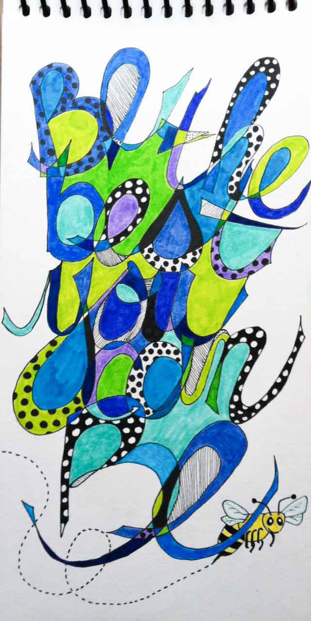
Here are some of the journal pages I've been playing around with as practise for the Letter Love 101 class.  It's great to get out all the markers and pens and just play.  In this first one I used copic markers for the colour in the flowers and stems and then I used pan pastels for the overall background colouring.  It's the first time I've used them, and I must say they are a lot of fun to work with.


After doing that page, I decided to try using the same techniques to make an ATC.  I found this much more challenging and realize that to be happier with the results, I'll have to start with a much finer marker when working on such a small scale piece.

The rest of the pictures show the transformation from black and white lettering to the colourful finished page. I used Pitt pens and Microns to do my lettering.

 Then I used my Copic markers to colour in the flowers...


...and some of the features in the grid lines.


 Still using the Copics, I coloured in some of the shapes created by the letters.  Here's what the page looks like with all of the marker work done.  Now, on to the background.


I used my Inktense watercolour pencils.  I love these pencils!  You use them just like a pencil crayon, pressing as hard or as soft as you like and blending and shading as you do with regular pencil crayons.  I wanted a soft background to contrast the bright pop of colour that the Copic markers provide, so I was shading lightly with the pencils.


Here's where the magic comes in.  Using one of these wonderful watercolour brushes, you just paint over the areas you coloured in with the Intense pencils to release the watercolour pigment!  I just keep a paper towel beside me as I work so I can switch from one colour to the next without muddying up my paint.  It really only takes a little dab on the paper towel and you're ready to go. This makes the Inktense pencils perfect for travelling since you don't need a water jar for cleaning your brush!

I just love how the colour pops as you brush over it with the aqua brush!  By the way, Inktense comes in various sets (in wonderful tins) but they also sell individually.  That means that when you eventually use up a favourite colour pencil (they last a long time) you can replace just that one colour that you need. 


Okay, so here's the crazy thing...the other day we went to the Bulk Barn and stocked up on all the various flours and other 'stuff' required for gluten free bread baking (that's a whole other story which I won't get in to here).  Gone are the days when I could just have a bag of "all purpose" flour in the pantry.  Well, as you can see from the photos below, everything kind of looks alike so I organized them into mason jars and labelled them.  Well, thanks to Joanne's influence I couldn't just write plain boring labels could I???  LOL  Thanks Joanne, my pantry looks "Letter Love"ly!