Showing posts with label metallic acrylic paint. Show all posts

Monday, November 11, 2013

A Blog Hop Featuring StencilGirl and Foam Board Express

 Today I'm participating in a blog hop with StencilGirl and Foam Board Express.

I've been meaning to come up with an organizer for all of my pens, pencils, scissors, etc. that I want to keep easily accessible on my desk so I designed one using foam core board, decorated with Terri Stegmiller's  Waves stencil.

Since I didn't have a sharp blade for my utility knife, I decided to try cutting the foam board with my paper cutter (guillotine). Although it did slightly crush the edge (not visible in the finished project), it gave me a good clean cut and made it fast and easy to get the pieces the size I wanted. 
I cut 2 pieces for the sides (11" X 4.5"), 1 piece slightly narrower but the same length (11" X 3.5") for the bottom, and then 5 pieces (4.5" X 3.25") for the sides and inner dividers.


Using a metallic turquoise acrylic paint and a make-up sponge, I stencilled part of the waves stencil onto the front, back and side pieces. I used a 0.8 Micron pen to outline the stencilling and to add some text to the front.


One the decorating was done, it was time to assemble the pieces.  I used PVA glue and regular straight pins to put it together.  The glue holds it long term, while the pins hold it until the glue dries and then give it a bit more stability (think mini rebar)


I glued the bottom edge of the front piece and then attached it to the edge of the bottom piece so that the side sat flush with the edge of the base.  The pins are stuck in through the the base and into the foam of the front piece (be careful to push them in straight so they don't poke through the paper layers).  I pin about every inch along the entire edge.


Apply glue to the bottom and front edge of one of the sides.  Place flush with the bottom and front pieces, and again pin to secure.  If any glue shows, wipe excess away before it dries, to avoid clear lumps of glue (especially on the outside).
You now need to do some measuring and draw a few pencil lines so you'll know where to put the pins for the inner dividers.  I made a mark along the edge at 5.5" to mark the centre, and then 2.75" from that centre line, to mark the quarter line.  You need to mark these lines on the inside of all three 11" pieces, and on the outside of the base and back pieces.

Draw in the pencil lines along the base, both inside and out, and the inside of the front piece.  These lines will allow you to position the dividers accurately, as well as figure out where to put in the pins.  Note, I didn't want pins all along the edges in front, so I only pinned the top and bottom and relied on the glue to hold the rest.  I did pin from the back all along the edge though since it didn't have the text decorating it.

Once all of the dividers are in and pinned from the bottom as well as anchored at the top and bottom edge of the front, it's time to add the final piece.
Put a bead of glue all along the top and side edges of the dividers and side pieces, as well as along the bottom edge of the back piece. Place it so that it sits on top of the edge of the base and tight against all of the dividers and sides.  Making sure that the sides and dividers are covering the lines you drew so that you know they're in the correct position, and then go ahead and pin to secure it all.  Once the glue dries it will be good and solid!


And here's what it looks like filled up and in place at the corner of my desk.


After organizing that area of my desk, I decided to make a little divider for one of the cubbies in this shelf.  Now instead of a 13" cube, I've got some shelves within it to organize some of the smaller bins and things.  Notice I left enough space at the side so the ATC display case can still stand at the side of that space. It was constructed in the same way, using glue and straight pins.  By adding a back, although not really necessary, you get that much more stability.

Before
After
And now, check out these great prizes...

INCREDIBLE PRIZE PACKAGE:

Foam Board Express is giving away:
Foam Board Express would like to offer a package of five (5) of its 20-inch by 30-inch flat display foam boards, including one black foam board, one white foam board and three additional foam board sheets in colours chosen by the winner.  Colour choices include:  green, red, yellow, dark blue, neon yellow, neon orange and neon pink. 

and 

StencilGirl is giving away:
Mary Beth's new DVD called: StencilGirl Mixed Media Sampler Journal 


All comments on all blogs eligible. Combined prize going to one winner.


You can check out Foam Board Express on their website and their FaceBook page and they've also launched a Pinterest site.


Don't forget to hop on over to the next stop on the blog hop and leave a comment!  

Linda Kittmer-You Are Here
Leslie Tucker Jenison-Your next stop on the HOP

GIVEAWAY (ends Thursday November 14th @ 11:59PM Central Time

Monday, February 25, 2013

A Triptych of Canvases

I've been working up the nerve to do some painting on canvas, but this is not something that is in my comfort zone.  In the last few weeks I've been watching Karen Ellis of The Art House Studio during her live Ustream broadcasts on Friday evenings, and I've learned a lot about how to get the wonderful layered look that she does so well for so many of her backgrounds.  Combine that with lesson 17 of Joanne Sharpe's Letter Love 201, in which we were to get out a little 6 inch canvas and some acrylic paint to create a 'Character Mastepiece" and I thought what the heck.  If I was going to jump in, why not jump in with both feet.  If one is good, three must be better...

I figured I had little to lose since I got the three little canvases at Dollarama, and with it being acrylic paint, if it was a total disaster I could always paint over it...

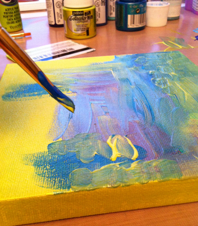
I started by painting all three of the canvases with a base coat of a bright lime green.  I then used a combination of my brush, and an old gift card and started adding some blues and a bit of purple along with more of the lime green.  A couple of the blues and the green are metallic paints, so they have a bit of a shimmer to them.

Using a stencil and a baby wipe, I added a bit of white.  The final step in creating the backgrounds was to use a bit of corrugated cardboard to stamp on each of the canvases.

Below you can see the three canvases side by side, as well as my messy work area.  Now that I've got a good craft mat, I tend to put the paint right on the mat.  It wipes up beautifully with baby wipes and I find it's easier than using a palette, especially when I want to stamp with corrugated cardboard or my ammo case insert (a great find at Waste Wise)


I must say, so far I was thrilled.  I actually achieved the layered look that I so admire in Karen's work!  The next step was to add a letter to each of the canvases.  I decided that since I had three canvases I'd use a three letter word.  I was going to do ART, but then I thought why not use the word I have chosen as my inspirational guiding word for 2013 and so, I painted JOY on my little canvases.

I found this fun font online when I did a Google search for fonts (looking at the images tab) so I sketched out the letters, transferred them onto my canvases and started painting.  I used a gold metallic paint, along with a bright yellow for the highlights and black for shading (as you can see, this time I did use a palette since I was painting with a brush and my finger).  I must say, I'm very happy with how these little pieces turned out.

And here you can see it hanging in my studio.  I'm not sure I like that arrangement, but I'll leave it like that for now.

Saturday, May 26, 2012

Breaking News


I'm sorry to say that computer gremlins have reeked havoc on some of the images on my blog and I have not been able to correct the problem.  In this case, the process shots are missing, but I was able to restore the image of the finished piece, and some close ups of the stitching which are at the end of the post.

No, I don't have anything particularly exciting to report other than I've finished a piece I've been working on rather extensively over the last few weeks.  'Breaking News' is the title of my newest mixed media piece.  It started with a cup of tea...

Last summer Doeteke, a friend of mine, was saving tea bags to use in her art and as I was drinking a cup of tea a couple of months ago I remembered this fact and started to save my own tea bags.  Then,  in April, Heather presented our GOE group with a challenge that involved using newspaper and the wheels started turning.
Sorry this image has gone missing and I can't
restore it...computer gremlins reeking havoc!
My first idea was to create a collage using wine labels and an article in the newspaper that talked about Copula's vineyards in California.  I decided to get my colour palette from the tea bags: mostly browns with some reds (from the herbal fruit teas).  I started with a piece of muslin, some acrylic paints mixed with gesso (thanks to something Leah, another friend and member of GOE, had said about a piece she was experimenting with) and my old driver's license, which I used to apply the paint.
Sorry this image has gone missing and I can't 
restore it...computer gremlins reeking havoc!
My next step was to use some matte medium to collage the wine labels (searched on-line and printed 'cause I just don't drink enough. LOL) and newspaper pieces (torn from the article mentioned above).  I then layered on some random pieces of hand-dyed cheese cloth to give it more texture.  So far it was going nowhere and I was feeling discouraged.

Sorry this image has gone missing and I can't 
restore it...computer gremlins reeking havoc!

I pulled out more paint, this time adding various metallics in coppers and golds as well as the original colours I had started with.  I also collaged some of the tea bags on at this point to try to get more of a subtle effect with the wine labels.  The tea bags are great for this because they have some opacity to them.  I was beginning to see hope at this point.  Ironically however, the more paint I added the less of the underlying collage I could see.

I have also been experimenting with rust dying lately and thought that some of the rust dyed fabric would work well on this piece.

Sorry this image has gone missing and I can't 
restore it...computer gremlins reeking havoc!
I cut several random circular pieces (freehand so they wouldn't be perfect), and I started laying them on top of the painted piece, auditioning their placement.  I settled on a gentle curved path that rose up from centre left and then curved down toward the bottom right corner.  The piece was looking too monochromatic at this point so I added some bits of a sheer black fabric to break it up a little.


I then grabbed a paint brush and some white paint to give it some pops of accent colour.  I started by painted the three circles near the centre left and then I created another random pathway, using straight lines and adding a few square shapes.  I also did some stamping using an old potato masher.  As I was adding the white I was sort of wishing I hadn't because it was just too glaringly bright.  

Seeing as the paint had for the most part obscured the newspaper and wine labels, I wanted to bring in some more newsprint (Remember the GOE challenge!) so I started tearing narrow strips and collaged them overtop of my white painted lines.    It was perfect to knock back the starkness while still keeping some accent.  A few more teabags were collaged over the potato masher stamps to knock them back a bit too.  By the way, at this point, the vineyard article was long gone and I was using newspaper from the front page of the paper.  That's when the name of the piece came to me.  Breaking news.  I was literally breaking (or tearing) news stories, and I was seeing words about killings, blood, etc.  That and the random areas of red paint, the footprints (or are they finger prints?) created by the potato masher stampings, and I began noticing 'evidence' appearing as if at a crime scene.

The next step was to layer it with batting and a backing and take it to the sewing machine for literally hours of intensive thread sketching/quilting.  I used a coppery red colour thread to highlight some of what I now saw as blood stains, as well as doing the pebbling effect on the rust dyed circles for some added texture.  A gold thread was used to bring out some of the areas that had been painted with the metallic paints, and the rest was stitched with a subtle taupe colour to create texture while at the same time pushing those areas back a bit.

Here are a few close up photos showing the stitching.  Click on them to enlarge, if desired.


And finally, here again is the finished piece, trimmed and ready for hanging.  I photographed it on a black background so that you can more easily see the shape of the finished piece.


Sunday, January 1, 2012

Steampunk On My Mind


Sometimes things just all line up and everything works out.  2012 is off to a great start.

My friend Leah set Steampunk as the theme for the next challenge for our GOE group.  When she sent the email, she included a link for a very funny Youtube video called Just Glue Some Gears On It (And Call It Steampunk).

While I was doing sketches and gathering ideas and materials to get started on this challenge, Lisa posted the theme "Metal" for this month's ATC swap.  Well, Steampunk and metal just seem a perfect match so I was off to the studio to play and these are the ATCs I made today.


Before adding some actual metal bits to the ATC, I started by using TAP to transfer images of gears on the background as well as the photo of the guy from the youtube video onto the copper sheeting.

And for my GOE friends, no this in not my challenge piece~just a warm up.