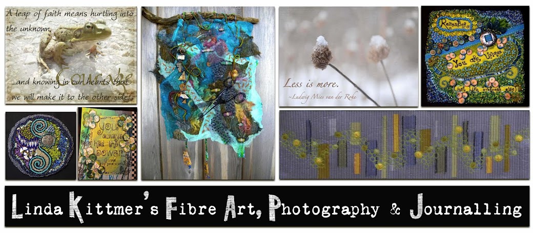
While cycling on a quiet side road near our cottage this summer, I almost ran over this silly frog that was crossing the road. Fortunately I had my iPhone with me so I was able to take this photo of him. When Kim's challenge was for us to think of a single word as the theme for today's Beyond Layer's challenge, the word courage came to mind. I looked for a suitable quote and when I found this one I decided that my little froggy friend would be perfect to illustrate the theme.
I used Kim's texture 'Lilly' in my processing which I though was appropriate since it made me think of lily pads :0)
Thursday, January 26, 2012
Tuesday, January 24, 2012
Texture Tuesday Theme for Jan. 24: "A Love Story"
This week's Texture Tuesday theme is "story" and what better story this time of year than a love story? This picture was taken a couple of years ago. Pictured are Casey, our golden retriever, and Spencer who was known as our 'puppy cat' because he behaved more like a dog than a cat. As the photo suggests, these two were inseparable buddies and they would often be found sleeping cuddled together.
About the photo:
-taken with my old point and shoot HP digital camera
-Kim Klassen's "all my lovin" texture at soft light 100%
-second layer of "all my lovin" texture at multiply 68%
-finally added Kim's "February magic edges" texture at screen 75%
Valentine Hearts
Valentine Art Quilts 8" x 10" |
My friend Diane sent me a lovely birthday card and there was a wonderful bonus in that the envelop was made with this wonderful 'love' paper (plain on the outside, but the 'love' text was on the inside). I took the envelop apart, tore some of it into small bits and added it to the neutral fabric I used for the background. Thanks Diane :0)
Close up of 'love' paper |
Monday, January 23, 2012
Six Words
Today's challenge in Beyond Layers, borrowed from Smith Magazine, is to tell your story in six words. My photo depicts that it's a long trail, but you've just got to keep taking one step at a time.
Yesterday, while my husband and I were driving back from visiting friends up near our cottage, we heard a news report about some research that indicates exercise in conjunction with meds actually showed better results for people suffering from depression than meds alone. Maybe that explains my compulsive need to cycle 30 to 40 km (for my American readers, thats around 19-25 miles) per day, hike or walk for hours with my dog, snow shoe (tried that for the first time yesterday), etc. I just need to keep moving, preferably in places where it is quiet, but using this image as my goal, I am working hard to move toward the light at the end of the path.
About the photo:
f/3.5, 1/1000, ISO 100, Lens: AF-S DX VR Zoom-Nikkor 18-55mm f3.5-5.6G
Processing:
-after adding the text, I used the multiply blend mode on the copy of the background layer
-created a boom vignette to highlight the natural sunlight that was lighting the path in the distance
-added Kim Klassen's texture 'canvas magic' at screen 100% opacity
Sunday, January 22, 2012
Texture Tuesday Theme for Jan. 17: "Open"
The Texture Tuesday theme for last week was 'Open' and this image came to mind immediately. I took this photo back in October while out walking some trails with my dog. I love the way the sun made the wispy white 'hairs' on the milkweed seeds to just sparkle. I added Kim Klassen's 'annabelle' texture using the multiply blend mode at 90% opacity.
Thursday, January 19, 2012
Photography: My Other Passion
In addition to my fibre art, my other passion is photography. I have taken Kim Klassen's wonderful (and free) online course called Skinny Mini which taught me the basics of Photoshop Elements 9, allowing me to digitally alter my photos. That led me to want to learn more, so I signed up for her Photoshop Essentials course (which was fabulous). Now, I have decided to participate in Beyond Layers - a Year of art~FULL Inspiration. This promises to be "52 weeks of encouragement, motivation and inspiration.......centred around, but so much more than photoshop...."
This photo is my first week's assignment. The photo was taken while walking on the Bruce Trail with my dog Casey.
About the photo:
f/5.6, 1/250, ISO 100, Lens: AF-S DX VR Zoom-Nikkor 18-55mm f3.5-5.6G
Processing:
-added Kim Klassen's texture 'awaken' at soft light 100% opacity
-used a layer mask and removed the above texture from the focus plant feature
-added 'awaken' texture again, this time at screen 41% opacity, again using a layer mask and removing the texture from the focus plant feature.
-text layers were added
-added Kim's texture 'february magic edges' at screen 100% opacity
Tuesday, January 17, 2012
Deborah's is Open !
My daughter in law, Deb, decided to go back to school to learn to be a hair stylist. She passed her exams in the fall and is now a licensed stylist. She and Dave did some home renovations to create a lovely home salon and she has passed all inspections and is open now for business in Guelph.
I thought it would be fun to make a sign for her to hang in her salon. I tried to keep it simple and let her name and the green that she's used in her decorating to be the focus. I'm headed there tomorrow for a much needed haircut and to surprise her with the sign. Yes, I'm counting on the fact that she won't look at my blog this evening. But I guess if she does she'll still be surprised. I hope she likes it.
Thursday, January 12, 2012
January's Bead Journal Project
My first piece for the 2012 Bead Journal Project is done. I started out with the square charm as a representation of my 50th birthday which I should have celebrated last year but because of circumstances it ended up being a non-event. I decided that I'd have a 'do over' this year to make up for it. LOL
The first step was to capture the square charm in a bead basket. After that I did the spirals ~ I do have a thing for spirals. The rest just came about intuitively. There were times in the process when I didn't like it much, but fortunately it all worked out in the end and I'm happy with the end result. The circle is the size of a CD (I traced one onto the Fast 2 Fuse that I used as my stabilizer) so it's just over 4 1/2 inches across.
Close up shows details of mica 'donuts' below the bead
stacks in the bottom left.
|
Basket Weave Artistry
Bill has been busy in his wood shop and he's now made 3 variations of the basket weave end-grain cutting board. It's difficult to choose a favourite. The wood grain in all of them is beautiful and I love the way the grain creates additional lines and pattern in the boards. Food prep becomes so much more fun when you're working on these beautifully crafted cutting boards.
Saturday, January 7, 2012
Altered Book / Journal
An old credit card was used to scrape the paint. Also added tissue tape in a long strip and short pieces (these had a calendar on them). |
The first step was to remove some of the pages (randomly throughout the book - not all from one section) to allow for the added bulk that the paint would add. I then glued together 3 pages at a time and stitched around the edges using a zigzag stitch on my sewing machine. You can get to within about 1 1/2 - 2 inches from the binding. This gives you good sturdy pages with which to work.
The next part was the hardest for me because it required a lot of time and patience. I covered each page with gesso, but because you don't want the pages to stick together you have to wait for each spread to dry before you can go on to the next. At this stage I used a light covering of white gesso, allowing some of the original text to show through.
Stamping was done using rubber stamps with acrylic paint. |
Inktense pencils give wonderfully vibrant colour. |
Now the fun begins. Using acrylic paint, Inktense watercolour pencils, markers (I like Copic markers), white gel pens, black gesso, etc. I began to play. Again this takes patience because you have to wait for pages to dry before you go on to the next spread or before you can begin to journal on the fun backgrounds that you've created.
Background ready for some sketching
and journaling.
|
Markers were used to colour in some
doodles on this page.
|
Water Lilies
I have decided to participate in the Colour Palette Challenge again this year. It's a great way to motivate me to work with colours that I might not otherwise put together (even though I seem to have them in my stash LOL). This year I'm planning on making 8" x 10" art quilts for this challenge.
Each month, Vicki creates a colour palette from one of her photographs. This is the January palette. Unfortunately, the colours were slightly off when I printed it, so you can see my colour choices don't quite match the palette selections. Oh well.
I love the blue and green (as you may have noticed from some of my other pieces) but I don't think I've ever added the burgundy to it. My design was inspired by some of the work done by Gloria Loughman, particularly the wonderful 'fan' shape with the circles on it. I added some spirals and curling 'tendrils' to add some flow to the piece and gave all of the circles a shadow to bring them forward. For this piece, I have done machine embroidery (buttonhole stitch) but in hindsight I'm thinking that some hand stitch and beading might be lacking. Is there a 12 step program for bead addicts?
Tuesday, January 3, 2012
Connected By A Thread
...or maybe that should read "hanging by a thread". LOL
Inspired by the 2012 ONN (Ontario Needleworker's Network) theme 'Connected', this evolved as a bit of a journal piece. All of the felted squares are connected by a path of beads that seems to be wandering about without any real purpose or direction. Some areas have been cut away to represent things that are falling apart and they are barely being held together by haphazard threads. The buttons and safety pins are an attempt to further 'hold it all together'.
Sunday, January 1, 2012
Steampunk On My Mind
Sometimes things just all line up and everything works out. 2012 is off to a great start.
My friend Leah set Steampunk as the theme for the next challenge for our GOE group. When she sent the email, she included a link for a very funny Youtube video called Just Glue Some Gears On It (And Call It Steampunk).
While I was doing sketches and gathering ideas and materials to get started on this challenge, Lisa posted the theme "Metal" for this month's ATC swap. Well, Steampunk and metal just seem a perfect match so I was off to the studio to play and these are the ATCs I made today.
Before adding some actual metal bits to the ATC, I started by using TAP to transfer images of gears on the background as well as the photo of the guy from the youtube video onto the copper sheeting.
And for my GOE friends, no this in not my challenge piece~just a warm up.
Subscribe to:
Posts (Atom)