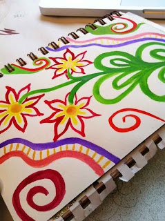
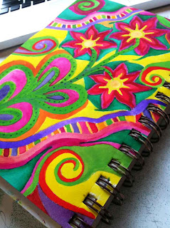
 As you may know from reading some of my previous posts, I am taking Joanne Sharpe's Color Love 101 online class. In the last couple of days I've been exploring the whole idea of doodling with a paint brush and watercolours. I discovered very quickly that I am way out of my comfort zone on this activity!
 I started with a cool colour palette since I love working with blues and greens. I added a bit of yellow to warm it up some and give it a bit more of a pop, but it's certainly not great. However, that was just my first attempt...
 My second try was with a warmer palette, bringing in reds, pinks, and oranges, but still using the green for some contrast. I think that my lines are too 'up tight'. Somehow I need to relax so I can get a more easy flow to my lines. Of course, if I truly learned to relax I wouldn't be me, now would I ;o)
You'll notice I included my favourite spiral lines...

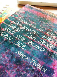
 As a complete aside, I had this background done on a page from many months ago, and I recently saw this wonderful quote by Mark Twain so I used my correction pen and wrote it out so I wouldn't forget it.
Love your coloralicious doodles.....! xox
ReplyDeleteThanks Corrine.
DeleteLinda, you have shown a wonderful knowledge of color in these studies, balancing the warm and cool colors perfectly. The quote by Mark Twain is a good one to remember. What is a "correction pen"?
ReplyDeleteThanks Connie. I love that quote. A correction pen is a 'white out' type fluid in pen form. I have a Bic Wite-out and a Pentel Correction Pen. They're great for writing in an opaque white on darker surfaces.
DeleteThanks Linda. Another item that needs to be added to my stash.
DeleteI'm happy to enable Connie. LOL
DeleteGorgeous!
ReplyDeleteThank you! :o)
DeleteI can't wait to take this class but I need to finish up with Letter Love 101 and I am learning so much that is out of my comfort zone...I just love stretching like this...it is scary but fun....beautiful colors.
ReplyDeleteYou are so right Danielle. I'm learning so much and it's good to stretch as you say and get out of our comfort zone now and then. Thanks for your visit.
DeleteLinda these look great! Practice, practice, practice.
ReplyDeleteAloha, Kate
Thanks Kate. And yes, I'll keep practising!
Delete