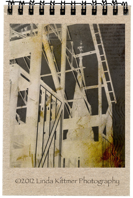
This photo is being shared on Texture Tuesday, Sweet Shot Tuesday, This or That Thursdays, Photo Art Friday, Shoot, Edit, Submit and Photo Friday Link Party.
Pages
▼
Tuesday, May 15, 2012
Preserving History While Moving Forward
This photo is being shared on Texture Tuesday, Sweet Shot Tuesday, This or That Thursdays, Photo Art Friday, Shoot, Edit, Submit and Photo Friday Link Party.


I love the way this came out! We had a gradient map last week but I haven't gotten around to listening to the directions and trying it out. What a great angle for the photo you took!
ReplyDeleteThanks Jean. It's fun to play with a photo and change it into something quite different.
DeleteI love the mouse over effect. It's always fun to see where it all began!
ReplyDeleteThanks. I've always liked being able to compare the original shot with the end result.
DeleteThank you. I'm so glad that you're able to learn something from my posts. If you haven't already do so, you might want to check Kim Klassen's Cafe where she offers a free Photoshop class called Skinny Mini. That's how I started out learning about Photoshop. Here's the link: (she'll be running the next session in July).
ReplyDeletehttp://www.kimklassencafe.com/elements-skinny-mini-ecourse
That is such an interesting processing! Really, really nice.
ReplyDeleteErika B
Thank you Erika. It's a lot of fun to change things up in Photoshop.
DeleteLovely effects! I love what you did with this - thank you for sharing!
ReplyDeleteThanks Sherri. Have a great week.
DeleteVery interesting, really delicious.
ReplyDeleteThank you. It was fun to manipulate the photo.
Deletethis is quite nice! Good job.
ReplyDeletegreat pic! :)
ReplyDeleteThanks Tina. It was a fun one to create.
DeleteThis is fabulous. I love the notebook image you used. Great inspiration, thanks
ReplyDeleteThank you Miriam. I really enjoyed working on this one.
DeleteI am glad to see that others like to do the same with the photo like you - I must say I am impressed by your work ;)
ReplyDeleteYou will be able to see my contribution here:
http://www.starone.dk/b6/?page_id=257
Thanks for showing!!!
Thanks Mariane. I'll be sure to take a look at your photo too.
DeleteI love those angles especially the blending of the old and new. Wonderful edit.
ReplyDeleteThanks Kaylene. When I saw the old steeple through the new beams I knew I had to get a photo.
DeleteCool. Valerie
ReplyDeleteGreat image! I love the notebook effect, too.
ReplyDeleteThanks. It makes a fun background.
DeleteWhat a creative edit Linda. Love the angles and lines in your image and the angle from which you took your shot to get the steeple showing thru the steel girders. So pleased you shared this piece with Photo Art Friday.
ReplyDeleteThanks Bonnie. I just loved the way the old and the new came together in this shot.
DeleteGorgeous!!! Love the overlay of the images!! Fabulous!
ReplyDeleteHugs
SueAnn
Thanks SueAnn. When I noticed the steeple and the new girders I just had to photograph them. I'm really glad the architect is using the old part of the building in the new design so that the two come together so seamlessly.
DeleteWow! this is really artistic! Love it
ReplyDeleteThank you Jeanne. It was a fun edit.
DeleteThis graphic elements and dramatic line whit old map looks very good. Wonderful! :)
ReplyDeleteThanks! Have a great weekend.
DeleteWonderful transformation! I love the slightly eerie look that you created.
ReplyDeleteThank you Linda. It was a fun edit.
DeleteGreat shot and love the processing you did (especially making it look like a little notebook).
ReplyDeleteThank you Kathy. It was a fun edit to work on. Have a great weekend.
DeleteFabulous piece showing great lines/angles.
ReplyDeleteYour edited version gave the photo a totally different feel. I liked seeing the original as well.
Thanks Ida. I agree it's fun to see the before and after, especially when they are so different.
DeleteThis is very cool Linda. It looks like you are enjoying PS very much, complementing your creativity! It must be fun! xx Kathy
ReplyDeleteThanks Kathy. Have a great long weekend.
DeleteLove combining old and new! Great edit.
ReplyDeleteThanks Pat. Have a great weekend.
DeleteThis came out very cool! Love your processing here! And the mouseover effect,- I envy you! I have tried to read how it works, but I didn't understand it!
ReplyDeleteHave a nice weekend:)
Thanks Monica. The mouse over effect is great isn't it. No need for envy, though. I got the info. from Kim Klassen's site. Here's the link to a tutorial and there's also a download that you can just cut and paste into your post, substituting your specific info. Have fun with it.
Deletehttp://www.kimklassencafe.com/thecafe/before-after-mouse-over-video-tutorial.html
Thank you Linda:) Maybe I'll understand the tutorial video:)
Delete