Thursday, February 28, 2013

Vintage...

Bonnie's challenge this week for Photo Art Friday was the word 'vintage'.  Well, after the fabulous gift I recently received there is no shortage of wonderful images to play with for this challenge!

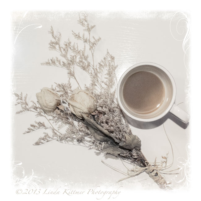
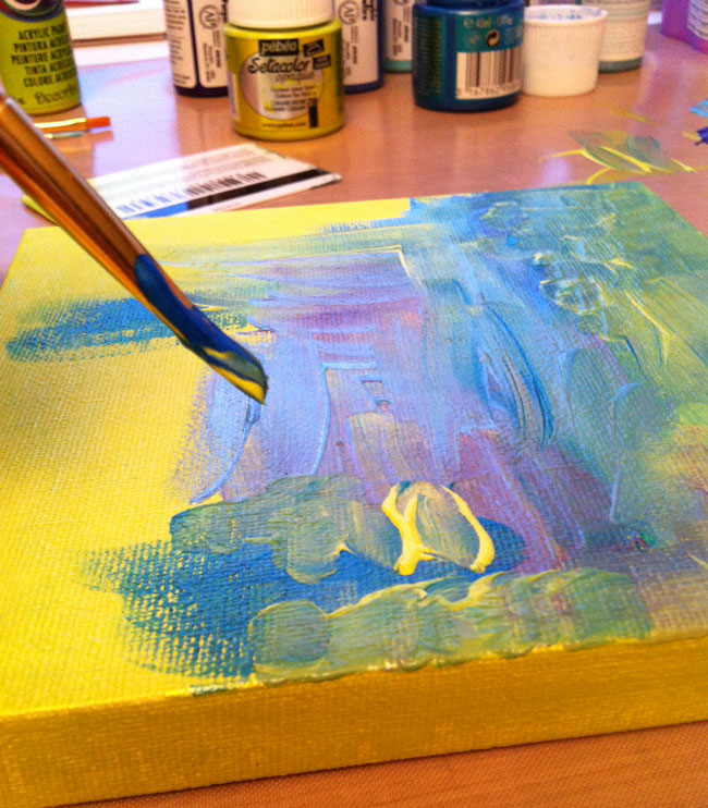
Mouse over photo to see the 'before' image.
I chose this photo of my Dad.  It's funny to see a cigarette in his hand. He quit smoking when I was a baby so I have no memory of him as a smoker.

As you can see when you mouse over to see the original image, I cropped it to bring my father closer.  While still in Lightroom, I created a sepia version of the image.  I then took both the original cropped image and the sepia version into Photoshop Elements when I layer the sepia one over the other.  I kept it at 'normal' blend mode, but reduced the opacity to about 65% to allow some of the original colour to come back.

I know any snapshots from back then would have had a white frame around them, something that of course is missing from the digitized slides, so I brought in a vintage frame that I have in my files (sorry, I can't remember where it's from, but you'll be able to find lots such things by Googling it). I placed the photo into the frame and called it done!

Update:  I Googled 'free vintage frames for photoshop' and found this frame with the old vintage corners and the scalloped edge at this site.  There are so many wonderful 'freebies' out there! How cool is that!


Wednesday, February 27, 2013

Looking Down...

Today's challenge in Beyond Beyond was to do a photo shoot from above so I set up this little still life and climbed on my chair!


In Lightroom I did some minor tinkering with highlights and shadows before using Kim's "Barely Colour" preset.  I then took it into Elements where I added three layers of Kim's "Anna" texture from her Downton collection. The first layer is at soft light 15%, then colour burn 14% and finally multiply at 11% with a gradient mask.  I also added a Jerry Jones texture to get the soft framing which I thought was pretty with this particular image.

A screen shot of my processing is here for your reference.


Bead Journal Project: February and a Red Herring

Here's the next instalment in my BJP 2013. I was a bit worried about how the puzzle pieces would come together since it's tricky to bead a perfectly straight edge when using little round beads, but as you can see in the second photo, showing the first two months together, the joint is not too bad.  Working on the little interlocking 'tabs' of the puzzle pieces is a bit tricky, and of course I have to be careful to make sure I'm using the right colours so that the little buildings match correctly from one piece to the next.  The bright sky is a nice juxtaposition to the gloomy February we've been having...I can't wait for Spring to get here!
Okay, it might not be a herring but it's a little red fish!  On Sunday evening, while watching the Academy Awards, I added the beads to this fish that I had sewn up earlier in the day.  He's about 3 1/2" long and he's going to be used as an embellishment on a piece I'm planning to enter into a juried show.

Tuesday, February 26, 2013

Dreamy Image

I explored Kim Klassen's tutorial on creating a 'dreamy' look to your image, and here's my result:

I used an image of my journal and Twinkling H20 watercolours, which I had been working on earlier.  I had used my 50mm 1.8 lens so that I could get that sweet depth of field.

I added a gradient using a soft pink to pick up some of the colour in the journal and the one paint pot.  In Lightroom, I edited Kim's texture, Edith, changing it from a gold colour to a pink tone and then added it with a soft light blend mode at a low opacity (around 35% or so).  The text was added using the font Sweetly Broken, and I picked a very soft pink shade from the image for my text colour. I also had to add a bit of a drop shadow to get the text to stand out enough to be legible without having to go to a darker font colour.

Linking up with Our World TuesdayTexture TuesdaySweet Shot Tuesday

Monday, February 25, 2013

A Triptych of Canvases

I've been working up the nerve to do some painting on canvas, but this is not something that is in my comfort zone.  In the last few weeks I've been watching Karen Ellis of The Art House Studio during her live Ustream broadcasts on Friday evenings, and I've learned a lot about how to get the wonderful layered look that she does so well for so many of her backgrounds.  Combine that with lesson 17 of Joanne Sharpe's Letter Love 201, in which we were to get out a little 6 inch canvas and some acrylic paint to create a 'Character Mastepiece" and I thought what the heck.  If I was going to jump in, why not jump in with both feet.  If one is good, three must be better...

I figured I had little to lose since I got the three little canvases at Dollarama, and with it being acrylic paint, if it was a total disaster I could always paint over it...

I started by painting all three of the canvases with a base coat of a bright lime green.  I then used a combination of my brush, and an old gift card and started adding some blues and a bit of purple along with more of the lime green.  A couple of the blues and the green are metallic paints, so they have a bit of a shimmer to them.

Using a stencil and a baby wipe, I added a bit of white.  The final step in creating the backgrounds was to use a bit of corrugated cardboard to stamp on each of the canvases.

Below you can see the three canvases side by side, as well as my messy work area.  Now that I've got a good craft mat, I tend to put the paint right on the mat.  It wipes up beautifully with baby wipes and I find it's easier than using a palette, especially when I want to stamp with corrugated cardboard or my ammo case insert (a great find at Waste Wise)


I must say, so far I was thrilled.  I actually achieved the layered look that I so admire in Karen's work!  The next step was to add a letter to each of the canvases.  I decided that since I had three canvases I'd use a three letter word.  I was going to do ART, but then I thought why not use the word I have chosen as my inspirational guiding word for 2013 and so, I painted JOY on my little canvases.

I found this fun font online when I did a Google search for fonts (looking at the images tab) so I sketched out the letters, transferred them onto my canvases and started painting.  I used a gold metallic paint, along with a bright yellow for the highlights and black for shading (as you can see, this time I did use a palette since I was painting with a brush and my finger).  I must say, I'm very happy with how these little pieces turned out.

And here you can see it hanging in my studio.  I'm not sure I like that arrangement, but I'll leave it like that for now.

Sunday, February 24, 2013

Doodling with a Paint Brush

I could definitely get used to doodling with a paintbrush. This is another spread that I started at the Decorative Doodling class.  As you can see at the top half of the page, I really got into a bit of a tiny spiral trance.  I was loving how the 'Twinks' layered so beautifully and the different tones of that fabulous green (Twinkling H2Os Olive Vine) that I was getting depending on the amount of paint on my brush.

When the paint was dry I added some outlining and doodles with a black Pitt pen and then added a 'sketchy text' quote by Frank Zappa.  "A mind is like a parachute.  It doesn't work unless it is open." True story! LOL

Saturday, February 23, 2013

Pearl Pen Doodling

Here are the two Pearl Pen doodles I started at Saturday's Decorative Doodling class.  This was a lot of fun, but it will take some practise to write with the Pearl paint pens.  You've got to keep moving at a steady pace, without touching the page or you get globs and ridges in the paint.   I added the doodles using a Pitt pen before painting with 'Twinks'.  I do love the shimmer in those watercolours with the mica!

Friday, February 22, 2013

Playing with Gelatos

Another piece from the Decorative Doodling class, this background was doodled using Gelatos.  A water brush was then used to activate the colour and allow it to spread.  For some reason the green didn't cooperate, but the rest of the colours were like painting with butta' to quote Karen Ellis (Art House Studio) and Joanne Sharpe.  I've added some doodles with a Pitt pen, but I have to say I'm not sold on the Gelatos yet...although the metalic ones were pretty cool!

Thursday, February 21, 2013

Finishing Up Some Decorative Doodles

On Sunday I posted about the Decorative Doodling class I took with Joanne Sharpe and I showed you the doodles I had started.  You'll never guess what I've been working on this week. LOL

Here are the first two I have finished. I really love the upper right part of the top page.  I think the left side of that one got a bit too busy and 'heavy' compared to the right side.

Looking at the bottom image, I've decided that if I plan to add colour I need to keep the petals on the flowers simpler.  It looking fine as a black and white doodle, but when I started painting them it just got crazy.  Maybe it's also my colour choice. I do like the little coloured 'pebbles' (bottom rt corner and left side), and I like the contrast of the black and white stripes and checks with all the colour on the page.

Wednesday, February 20, 2013

Art Tags...a Little Something from Nothing


When I'm working with either watercolour or acrylic paint these days, I like to keep a couple of blank tags on my desk.  Instead of wasting the paint that's on my brush when I want to change colours, I doodle with the brush on one or both of the tags to use up as much of the paint as I can.  I end up with some interesting backgrounds and then later, I can add some doodles and lettering with a black pen to finish the tag.

This first tag was made using Twinkling H2Os or Twinks as they're often called.  I was working on some of the pieces I started on Saturday night.

I've also been playing around with writing with my glue gun (a lesson in the Letter Love 201 class).  I had a package of sparkly glue sticks in gold, silver, red, blue and green, so I thought I'd see what the gold and silver looked like using this technique.  I must say, I think I prefer the control I get from the dimensional Pearl Pens, and they seem to result in a very similar look, but the one neat thing the glue gun lets you do is create a dimensional word on your not stick mat and then pick it up and use it as an embellishment on another piece.  The Pearl Pens may work for this too, but I'll have to experiment to be sure.  The glue gun glue certainly dries quickly which is a real bonus!

While painting some of these with Silks acrylic glaze, I was again cleaning my paintbrush on a couple of blank tags.  You can see the painted tags on the right of this shot.

After doing some sewing, I went back and added some doodles to the tags using Pitt pens in black and silver, and a white Signo pen.  So far, I think I'm liking these tags more than the glue gun words, but I'll have to reserve judgement until I figure out how I'm going to use them in an art journal page.

And finally, here's a page I created using one of the glue gun words.  I did the word on a navy blue card stock and then lay it over the white journal page before spraying it with a copper Perfect Pearls mist.  I then moved the dark card stock out of the way and sprayed some bright yellow Dylusions ink onto the page.  I off set the card stock so that it would give me a bit of a bright highlight along the lower edge and to the right.  I added a quote in that space.  Finally I used a star shaped hole punch to cut the stars in the card stock and then I glued them randomly around on the yellow paper.  I found that the gold glue gun glue didn't show up as well as I hoped so I added a bit of a highlight using the white Signo pen. It actually stands out quite well but I couldn't seem to get a good shot that does it justice.


Tuesday, February 19, 2013

Connecting With My Past

This week, I got a small parcel in the mail.  It's always exciting to get unexpected surprises, but this turned out to be the best present I may have ever received.  You see, the package contained CDs of digitized images of all of my Dad's old slides.  It turns out that my brother Wolfgang, the handsome little fellow with the vest on, had taken the many boxes of slides (almost 3,000 images) and scanned them into his computer, over the period of several weeks, so that he could digitize all of our family images and then he sent a set of the disks to each of his sibs.

The timing is fabulous since as you may know from recent posts, I have just started using Lightroom and I'm in the process of organizing all of my images.  I can't tell you how thrilled I am to have all of these images, dating back to the late 50s, of my brothers and I growing up. The pictures date back to shortly after my parents and three oldest brothers arrived from Germany, through to the mid 80s.

And so this week, I'm taking a trip down memory lane, to a shot of my four brothers with me, their baby sister.  Yes, I'm the youngest of five and the only girl.  And to make life even more interesting, when I was four my aunt and my cousin Karl came to live with us so from that point on I essentially had five older brothers, two moms and my dad!

I'm not sure what the occasion is in this picture...perhaps there wasn't one, because I know that Mom would have us dress up for family photos now and then 'just because'.

I didn't have to do much to get that vintage feel in these images LOL.  I added a layer of Kim Klassen's 'Daisy' texture (from her new Downton Abbey Collection) at soft light, using a 75% opacity, and then brushed most of that off of our faces, leaving a soft vignette around the outside of the image.  I also decided to add the vintage frame to the image since the slides, and therefore the digital images, were missing that.

In this second image, probably taken about a year later, we have the five of us again.  This may actually be my favourite picture of the five of us!  Again I added a bit of a texture (Isobel, from the same collection).  As with the other image, I used a soft light blend mode and removed most of the texture from our faces before adding the frame.

It's going to take me some time to get through all of these photos and add keywords, etc. but as I'm sure you can imagine, it is going to be a labour of love!

Linking up with Our World TuesdayTexture TuesdaySweet Shot Tuesday and Photo Art Friday.

Monday, February 18, 2013

I Need A Plan 'B'...

after
A few days ago I posted about an experiment I was trying based on something I had read online over a year ago.  Well, unfortunately either I am not remembering things correctly or I'm just unlucky. 

This is the piece I've been working on and after hours of piecing and wrestling with grass trimmer plastic to do the free motion quilting, it was supposed to shrink!  The small sample piece of wool that I tested shrank, but this piece, which is entirely backed in the same wool, unfortunately did not get the memo!  I used the sanitize cycle on my washer and the hottest setting on the dryer...You can be sure that if they were a pair of pants or a favourite sweater they'd now fit a Barbie, but sadly when I wanted, even needed, this to shrink considerably...nothing!  

I guess I can be happy that at least the dyeing process worked as I had planned.  If you compare the before and after images you can see that the after image, while still having a pleasing variations to the different shades of blue, has a more cohesive look to the colour.  But, instead of having a really interesting textural piece, I have a rather boring blue quilt...certainly not the 'fibre art' I was shooting for!
before
And so, I need to figure out a plan 'B'.  I have no idea where I will go from here...

What do you do with a very boring blue 'quilt' with funny plastic strips running through it?  I'll have to ponder this for a while and get back to you...

...'sigh'  

Sunday, February 17, 2013

Decorative Doodling...

Well, I finally met the Art Queen herself, Joanne Sharpe.  It was great to meet her in person after a year long friendship on line through Facebook and Joanne's online classes.  As you can imagine, she's even more fun in person!

Kim, another online friend surprise me.  She had told me she would be there during the day and since I was going to be there in the evening, we would not be able to meet.  As it turned out, Kim also signed up for the evening class and we ended up sitting at the same table!

Then, as a total surprise, my friend Jan, a member of GOE (our fibre art group) was there too.  She was a my place on Wednesday and had meant to ask me if I was going but she got side tracked and never did...


Here's a shot of Joanne teaching us some new doodling ideas and a fun collective puzzle doodle that we created.
I started a lot of little pieces, playing with the ideas and media that Joanne shared with us. None of these are finished, but I thought I'd show you what I've got and then repost some time when I can show you the finished pieces.


And, I was able to pick up a copy of the new Somerset Studio magazine and Joanne was sweet enough to sign it for me! ...'sigh'


If you ever get a chance to take a class with Joanne, online, or especially in person, I can highly recommend it.  She's an incredible teacher!

Saturday, February 16, 2013

Playing with Words

On Valentine's Day, our Letter Love 201 exercise was to write the words, "Love, love, love. Do what you love" (I can hear you from here Leah! LOL). So I played with different letter styles and had some fun.  I especially like what I came up with for the last word at the bottom. 

 I really liked how using the word to create the word worked for me, and I thought my clever (if I do say so myself) little hearts wrapped around the bottom border where fun. I also really liked the black and white, so I left it there...

Then, this morning I decided to play some more with this technique.  I wrote the words "Play with your words", again using words to create the letters.  I also hid a subliminal message in the page...

I like the ribbon effect that I'm achieving, and I had fun again wrapping it around the border.

This page didn't pop, probably because everything is the same weight and there's really not focal point, so I got the Tombow's out and created a shadow effect with this pretty aqua colour.  This close up shows the effect of the Tombow before the ink was activated with water, creating the sharper shadows (right and bottom) and the softer watercolour effect achieved by activating the ink with a water brush (left and top).


And here's what the whole page looks like: 


The hidden message...the large words obviously say "Play with your words".  The word play was made by repeatedly writing play as you can see in the close up above.  However, with is made up of the words 'but' (the w and i) and 'not' (t and h) and the word 'your' is made of 'with' (y and o) and your (u and r) and then 'words' is made by repeatedly writing 'food'.  My mother's in my head today. :o)

Now, you've all heard the expression "Leave well enough along."  I wish I had...

Perhaps if I go back and do some more, stronger watercolour in the negative space I can salvage it...or maybe I just put down the brush and walk away...


Friday, February 15, 2013

Five Layers of Fun...

...or perhaps a few more.

One of the lessons in Letter Love 201 was to try working with a dry brush technique while lettering with a paintbrush.  A few weeks ago I bought some liquid frisquet or frisket (*see end of post for more info) and I thought this might be a great place to try it out.

1. I started by using the dry brush technique to write the words.  Then I painted over them with watercolour and used a bit of Dylusion's spray (yellow) through a stencil.

1a. You can see the texture created by the dry brushing. Interesting to note that the  Dylusion's spray seemed to go through the frisket in some areas.

2. I added some white lines, using a Uniball Signo, around the letters to give them a bit more pop, particularly because some on the right side didn't show up too well (dry brush was a bit too dry).

3. Still using the white pen, I added the border and the white 'bubbles'.

4. and 4a. Show the highlights I added to the bubbles and the cross hatching in the border.

5. and 5a. The final step was to add another layer of texture by journalling in the red areas. I decided to use a very fine black pen (0.05 Micron) so that the journalling would be very subtle.

And here's the finished page:


*Liquid frisket, or masking fluid, is a combination of latex and ammonia that is used by artists to temporarily block out a portion of a painting until the areas surrounding it has been completed. It can then be gently removed so that portion can be painted or left white.
Masking fluid is similar in consistency and texture to paper cement/rubber cement glue. Once applied to the paper, it dries fairly quickly, developing a rubbery texture that you can rub off with your finger or an eraser.

Thursday, February 14, 2013

Fingers Crossed...

My cat, Arbour, finally let me finish the quilting on this challenge piece and I finished sewing on the binding last night.  Now for the scary part...

This piece is an experiment, based on something I read online about a year ago.  At the time I thought it sounded interesting but didn't think I wanted to try it.  Unfortunately I now want to play with the idea but I don't recall the site, and haven't been unable to find it again.

Best I can remember, it involves sewing pieces of plastic grass trimmer cord into the quilt, which has a wool backing.  The next step is to do some immersion dyeing and then to wash the piece and dry it in the dryer so that the wool shrinks.  The plastic cord, of course,  will not shrink, thus creating interesting ripples...

I'm worried about going to the next step, but the quilt as it is now is not is very inspiring, so apart from hours of piecing and quilting (a great challenge, fighting the plastic cording...not to mention the three machine needles I broke), what have I got to loose?

As I said in the title of this post, fingers crossed...

I hope to be able to post about the next few stages soon.

Happy Valentine's Day!

Wednesday, February 13, 2013

Taking Time for Fibre Art

In addition to all of the art journalling I've been doing lately, my other passion is to 'doodle' with my sewing machine.  I started this piece almost two years ago when my friend Heather gave me an intriquing piece of silk.

I have been working on it slowly, adding hours of hand stitch as I showed in this previous post.  I'm still not exactly sure where this piece is taking me, but I knew that the next step was to add some free motion quilting of these fun little 'pebbles' to fill in the areas that didn't have any dye on them, and therefore didn't get hand stitched.

I love how the machine work flattens the areas between the hand stitch, allowing the hand stitched areas to come to the forefront.

With this step done, I now continue to look at the piece waiting for it to give me some idea of what is to come next...

Tuesday, February 12, 2013

Puppy Love...


Last spring, our neigbours got Buddy, a Shih Tze puppy.  From the first day they got him, as they tried to walk past our back yard (we're on a corner lot), Buddy saw Casey and just walk in through our fence to visit with her.  It was love at first sight for all of us!  Casey was about to turn 12, a senior for a dog her size, and here was this tiny puppy that just wanted to jump up on her and give her kisses...so adorable!

As you can see in the top left image, Casey was quick to get in on the pouncing fun.  Although we certainly see signs of her age at times, when Buddy's around Casey just becomes like an over grown puppy herself.  It's so fun to watch them wrestle and play and I really think he helps to keep her young.  However, notice the very centre image...that's Casey's way of imposing a short break to get a little rest.  Has she captured an adorable little sleep toy or what!

These days its a bit of a tight squeeze for Buddy to get through the fence, but they still play regularly, and right now they are loving the snow!

This photo collage was creating using the print module in Lightroom 4.  I then exported it to  PSE 11 where I added a subtle soft texture called Cora, by Kim Klassen, at a soft light blend mode and lowered the opacity.  I put a layer of the digital scrapbook paper with the musical notes over the lower part only, and again lowered the opacity to allow the text to show through.  The final step was to use a variety of heart brushes to stamp on the little hearts on the last image as well as over the text area.  Love is in the air...

Monday, February 11, 2013

Feelin' Groovy...

What a riot!  There's another hour gone...  Sipping my morning coffee, Simon and Garfunkel's 59th Street Band's Feelin' Groovy blaring in the background and armed with my Sharpies, I had a flash back to the late 60's as I played around with lesson 9 in Joanne's online class.  When I finished my name, I decided to cut it out, glue it onto a page prepared with black gesso and then using a white pen I wrote the lyrics to Feelin' Groovy around the outside.  There was still some space left at the sides, so some 'groovy' doodles, made with metalic markers, filled those up nicely.

Sunday, February 10, 2013

I Really Need Some Discipline...


My plan for yesterday was to do some sewing.  I've got several art quilts in process that I really want to finish (honest!).

Enter Joanne Sharpe and her Letter Love 201 online class...  I know I can do these 'lessons' whenever I want.  I don't have to keep at them because as Joanne always reminds us, "You bought the book! You have these lessons forever!" But they're just so much fun.  I can just sit at my desk with my pens and watercolours and play all day.

After dinner I finally 'forced' myself to spend an hour sewing... and then you won't believe what happened... Yup, I was back at that damned desk with a pen in my hand...

Anyway, here are a couple of pages I did.  I love both of these quotes. In fact, if you look closely at the page with the white writing you'll see that I used these same quotes under the large focal word on the respective pieces.


Can you tell that Valentine's Day is coming soon?


Saturday, February 9, 2013

Not Your Average Chipmunk...

I don't often take video, but in the summer, when my little friend Charlie was coming to visit for peanut treats, I decided to document it by using the video camera on my iPhone.  You may be getting sick of hearing this, but Lightroom is amazing!  Today in Round Trip, I learned that you can very easily capture jpeg images from video you've shot.  That's how I got this wonderful series of me feeding and patting my little chipmunk friend.  

You might also enjoy an older post in which I've included a short video of my giving one of the chipmunks a bit of a back rub.  This particular chipmunk would come up on my lap to be patted even if I didn't have any peanuts for it.

It's quite amazing, but we've taught our Golden Retriever, Casey, to leave the chipmunks alone.  All I have to say if one comes up on the deck is, "Leave it Casey.  That's mom's friend." and Casey will just watch it and not bother it at all.  They have become so used to one another that the chipmunks will sometimes go up and sniff her paws while she's sleeping.  If she notices she just lifts her head and looks at them.

And it would seem that she can tell the difference between chipmunks and red squirrels (which can be very annoying and destructive) because she'll chase them away if they come on the deck.  She's one smart dog!